Streamlining the National Geographic Grants Application Experience

B2C

Redesign

Design System

TIMELINE
Oct 2022 - Feb 2023
(15 weeks)

ROLE
Lead UX Designer (Contract)
on Funding Experience Pod

PLATFORM
Web
(Desktop and Mobile)

TEAM
2 Designers, 1 Product Manager,
1 Engineer

TLDR;

Problem
The current grant application experience is outdated, unclear, and a discouraging starting point for funding seekers. Because of the negative experience, customer satisfaction has declined while customer support inquiries have increased.

Solution
After gathering insights, I identified opportunities to improve the experience by creating a deciding eligibility quiz, simplifying the information architecture of application questions, streamlining the user flow, and leading a comprehensive redesign of the application form.

Impact
The comprehensive redesign of the grants application resulted in significant positive outcomes, including notable reductions in application completion time, increased customer satisfaction, fewer service desk inquiries, and a remarkable increase in the application success rate.

My Role
Lead UX designer, notably working on the visual redesign. I aggregated research to create a holistic user journey map and identified key pain points, created and iterated on components, generated six initial concepts across devices, and collaborated with business and data stakeholders to improve the holistic application experience.

Jump to Final Designs
CONTEXT
The grants application is the gateway to becoming an NGS explorer
National Geographic Society (NGS) is the non-profit arm of National Geographic, providing funding to exceptional explorers who illuminate and protect our world. (E.g. Shannon is a young explorer raising awareness about the global garbage crisis)

The process of becoming an explorer requires individuals, or funding seekers, to submit an application and upon approval, receive their grant.
PROBLEM
Funding seekers want to successfully receive a grant, but the current application experience is a frustrating starting point
The application is demanding for funding seekers, requiring thorough preparation and taking around 1.5 hours to complete. We have heard from users that there is an excessive amount of technical issues resulting in extended application completion time and increased customer support and complaints. Rather than empowering funding seekers, the application has become a hindrance.
Objective
Let's think of ways to streamline the application!
We want to discover opportunities, ideate, and design end-to-end solutions to create an easy to use proposal development and submission process that increases usability, decreases time-on-task, and increases customer satisfaction.
KPI
Metrics to determine success of this project
1. Reduce Time on Task
Streamline application workflow so funding seekers can work faster to complete an application
4. Increase Application Success Rate
Enhance the chances of successful proposals by providing clear guidance and a sleek redesign
2. Reduce Service Desk Inquiries
Decrease in volume of frequency regarding questions we are directly solving for to save time and resources
5. Increase Click-Through Rate
Encourage users to access and use resources to improve their preparation for the application process
3. Decrease Manual Friction
Eliminates submission of ineligible applications so staff can refocus their time on other tasks
6. Increase Customer Satisfaction Rate
The user-focused redesign will result in a more positive experience among funding seekers
research
The current grants application reveals usability issues
An audit reveals various issues resulting in unnecessary delays throughout filling out the grants application. While the application allows users to submit a proposal, it lacks clarity, consistency, and professionalism which hinders the primary objective of empowering users to successfully receive a grant from NGS.
Consistency and Standards
The design falls short of professional standards, with awkward spacing, illegible text, static input boxes that obstruct text visibility upon input, and a lack of progress indicators.
Match between system and real world
Funding seekers encountered technical challenges while answering certain questions due to unclear input fields and the use of specialized business terminology in the questions.
Direct and indirect competitors provided inspiration for the redesign
NGS' grants application is at a similar stage to other grant organizations. We have the opportunity to improve our application by applying usability and accessibility standards. A noteworthy observation was that competitors require no mandatory account creation; prospective applicants can opt to create an account or not.
However, their application designs had very poor user experience. Instead, I examined forms from platforms like Workday, Braintrust, and Indeed. These applications utilized progress bars to gauge application completion time and facilitate section-based navigation which allow easy edits. The designs also had very few questions on each section, enabling users to complete the application in manageable portions.
Consolidating research findings into an end-to-end user journey map revealed key pain points
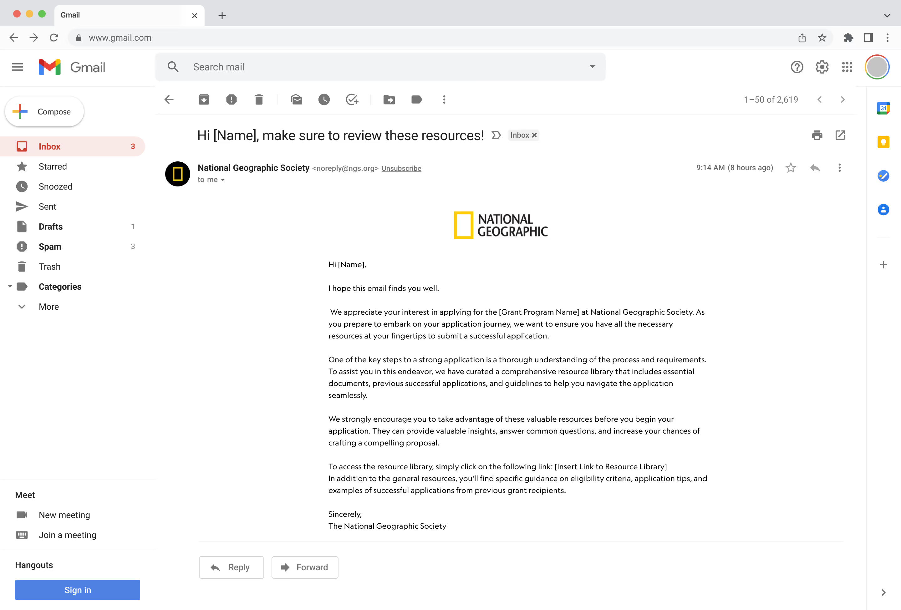
To ensure an aligned mental model, we led a workshop with the business concepts team to further understand changes in the journey, notable insights surrounding the application phase, and to frame the holistic experience for future design initiatives.
Key Insights

19%

of submitted applications were ineligible this year

83%

of users had technical problems when using the application

78%

believes this application form does not reflect NGS' brand

30+

inquiry and complaint emails support team receives a week
" As someone who's not tech-savvy, the technical issues within the application were a nightmare. It felt like the system was working against me, and I wondered if I should even bother applying."
- Egyptologist Explorer
"I remember messaging the support team back and forth for a week to figure out how to fill out some parts of the application. It was tiring."
- Biologist Explorer
key pain points
Our assumptions were wrong
We initially thought the main problems funding seekers experienced were caused by technical issues in the application. However, user research revealed that the top difficulties funding seekers encountered were actually:
🎨
Outdated Design
Unclear design leads to an inconsistent user experience and difficulties when filling out the application form
🤔
Unclear Eligibility Requirements
Users apply for grants they are ineligible for which wastes both their time and effort and increases manual friction for staff to filter
🔖
Missing Resources
Users don't understand how to answer certain questions and can't find resources from NGS to help them, leading to an increase in customer support inquiries
IDEATION
After analyzing the user research, the team saw design opportunities that mainly covers:
🌟
Clarity
Full transparency of grants information, eligibility, deadlines, application requirements presented.
🤏
Concise Information
Request only essential info, eliminate complexity and jargon, provide resources for best answers.
🥳
Delightful Experience
Empower funding seekers to feel accomplished throughout the recruitment to submission process.
Enabling easy application access by removing the mandatory account creation barrier
Previously, NGS required users to create an account before accessing and submitting applications, hindering those who wanted to preview the application (+ we have a downloadable pdf that users couldn't find 😅) Now, users can access the application without an account, only needing one to save progress or submit the final version.
Redefining the information architecture of questions through an open card sort to present questions in a logical manner


The business created new questions for the application because of internal changes. As a result, these new questions required logical grouping for users to answer and the internal team to review.

I conducted an open card sort with stakeholders to establish a streamlined structure, reducing sections from nine to five and condensing the overall application.
explorations
Brainstorming ideas and solutions
After redefining the IA and user flow, I began to brainstorm ideas to directly solve pain points. These solutions included redesigns of existing pages and also new features. I made lo-fi designs to test out the viability of these ideas, and to get quick feedback from the team. Based on feedback, I created higher fidelity mockups of the most promising ideas.
Below are some examples of explorations and iterations:
Creating a quiz with deciding questions to remove non-eligible applicants
Not only does this solution save time for our internal staff so that they are only reviewing eligible applications, but it also ensures that funding seekers are not putting in time in applying for something they wouldn't qualify for.
Users can manually check if they meet eligibility requirements before they begin the application or create an account.
To ensure applicants understand their eligibility, I transformed the eligibility requirements into a quiz with deciding questions. This exploration introduced a constraint requiring users to finish the form before applying, while also automating the eligibility confirmation process.
Ditched modal designs because questions varied in answers options which resulted in an inconsistent modal experience.
Providing resources through a page better aligned with user's mental models
Through user interviews, we found that resources that funding seekers needed were not on the page that they expected it to be and not prominently displayed on our website. Based on this feedback, I decided to place these resources on a new screen.
A dedicated section within the application interface that houses all essential resources organized into categories for easy navigation. This idea was considered as an adjacent feature to the application form as it would be within the same interface, but stakeholders preferred a more direct solution.
Email reminders which include direct links to the resource library to encourage applicants to review essential resources before they start the application. While useful, they rely on user engagement and may not be opened or acted upon by all applicants and. It also requires effort in building out email automation.
Placed all resources on the first screen the user will encounter along with other essential information (e.g. estimate time to completion) to better prepare them for the application ahead.
Redesigning the UI of the application form
Our primary focus for the visual redesign was giving the platform a facelift by utilizing what was available in our current design system and maintaining consistency across our consumer-facing products. I began by reorganizing the visual hierarchy to reduce cognitive load and introducing components that our team agreed on.
Pros: Users can view and complete the entire form at once, allowing for consistent context across questions. It's quicker for users who are comfortable with lengthy forms.

Cons: The potential for user fatigue, cognitive overload, and difficulty in navigation might lead to abandonment or errors.
Pros: Reduces cognitive load and user fatigue. Provides a sense of progress as users move through the form. Minimizes the risk of feeling overwhelmed.

Cons: Progress might feel slower. Users might lose sight of the context of the entire form. Navigational structure needs to be well-designed.
Preference test indicated that the bite sized form resonated more with our users, so I created several iterations. Users expressed a need to move back and forth between questions, particularly for making edits to specific questions.
Refined design by:
• Making better use of the real estate by playing with the grid and component sizes
• Reorganizing visual hierarchy by refining font weight and spacing
• Combining progress bar and navigation components to minimize distractions
• Enabled navigation to seamlessly navigate between sections and efficiently access specific questions
design system
Customizing components that align with established design standards to improve the overall user experience
The absence of responsive input field components in the design system led to the need for creating new variations and states to reflect user's actions.

States and Variations

The newly added progress navigation bar provided an accurate representation of the application flow, offering users visual progress indication and navigation, addressing a previously absent component in the design system with detailed element and states.

Progress Component Development

refine
A/B testing the perceptions of initial users between the original design and the new design
My teammate compared the designs in five key dimensions: satisfaction, desirability, trustworthiness, professionalism, and initial engagement. The test served as an indicator of our progress in the right direction from a marketing and branding standpoint.
Usability testing to measure success, satisfaction, and ease of use for critical tasks
The results showed that users had an easier time completing the application, answering questions, and being satisfied with the ability to see their progress.

Translated designs to mobile!

By refining our design system, funding seekers can effectively use the application's user interface.

By strategically presenting crucial information, funding seekers are now equipped with the necessary tools to navigate the application process with confidence.

By offering a streamlined process for confirming eligibility, funding seekers can avoid investing time in applications they don't qualify for.
Impact 🎯
As a result of this holistic redesign effort, the grants application now stands as a testament to the organization's commitment to supporting visionary explorers and their impactful projects, aligning with NGS's vision of becoming a globally renowned grants program by 2030!

Unfortunately, because of the terms of my contract, I'm unable to witness the launch of the new grants application. However, user testing will be underway for my redesign and after it is refined, it will be used by thousands of funding seekers!
Future Considerations 🔮
Due to the length of my contract, I was unable to iterate on the designs. Some changes to consider from usability testing insights are:
• Creating a user flow where the funding seeker is not logged in

• Automate PDF parsing to extract details and pre-filled field of completed applications

• Revisiting the conditional logic of certain sections to minimize guess-work (e.g. project team section)
• Incorporating delightful micro-animations or elements in the application to resonate with the brand!

• To develop a thoughtful and targeted global recruitment strategy we need to ensure that all application materials are accessible (allow applications to be submitted in local languages?)
Takeaways
Captivating the Business 🤯
I learned to find efficient ways to tell stories that work for you so that everyone understands the validation for your design approach.
Keeping Research Lean 🤏
Insights that are not shared effectively are invisible to your stakeholders, keep research lean to save time for both yourself and stakeholders!
Best Practice ≠ Best Solution 🧠
Choosing between a single vs. multi-page form taught me that design-thinking is contexually-based on target users and their desired objectives.
Back to Top
THE TEAM :)
I'm very grateful to have worked with such a wonderful team of designers 💛
Our interactive holiday card we created!! 

Thanks for being here. ٩(。•́‿•̀。)۶

⤹˚˖ ୭ Conservice
Wayfair °˖➴