Research
Identifying if CareerHub is meeting minimum acceptable experience standards
For my initial research, I decided to conduct a heuristic evaluation to identify if CareerHub is meeting minimum acceptable experience standards. This evaluation was conducted Figma for transparency between the team. It allowed us to prioritize which issues to work on, understand if issues can actually be changed, and note if it is a back-end problem.

Key Takeaways 🎆: There are many usability issues across devices that can be fixed by revisiting the Wayfair design system, redefining the information architecture, and visually redesigning components.
Conducting usability testing with 10 warehouse employees on mobile devices to understand key behaviours, frustrations, and needs
Key Takeaways 🎆:
1. CareerHub is an essential platform 📅
10/10 warehouse employees use CareerHub at least once a week to either apply for corporate jobs at Wayfair or refer friends to open positions for the referral bonus.
2. Break time = CareerHub time 🍱
10/10 warehouse employees only use CareerHub during their breaks, so they want the experience to be quick and easy.
3. One device per ~40 employees📱
6/10 warehouse employees would rather use the warehouse desktop than their own mobile devices, so they have to line up to access CareerHub.
4. A lot of usability Issues of key tasks 🔑
8/10 warehouse employees encountered usability issues with navigating the portal, applying for open positions, and understanding the search capabilities.
Using a prioritization matrix to identify top-priority pain points
I scheduled a meeting with the team to run through the evaluation, share my user research findings, and score each issue on a prioritization matrix. This visualization helped prioritize which problems to focus on first and communicate progress in solving issues back to stakeholders and the team over time.
By the end of the meeting, we established two goals for this project:
1) Optimize CareerHub for Mobile and Tablet Devices 🛠️
2) Improve the overall User Experience of Key Tasks ⭐
Optimizing CareerHub for Mobile and Tablet Devices
The current mobile experience of CareerHub is functional, but lacks optimization. Given that the majority of our corporate users access it through desktop, addressing user experience issues hasn't been a primary focus. Because the portal was not originally designed for mobile devices, components do not scale properly and there’s little documentation on how pages should behave at certain breakpoints.
I adopted a mobile-first approach to ensure an intuitive navigation and prioritised content. This stage included visual-based changes. Below is an example of my redesign of the navigation menu:
The current navigation consists of four buttons:

1. Feedback Button - leads to a feedback form hosted on google forms

2. Email Alerts Button - only shown when a user is on the internal mobility section

3&4. Internal Mobility and Referrals Section - dropdown displays related sub-pages
The problems with the current navigation:

1. Menu items stagger and look unprofessional

2. Repeated items create duplicate navigation menus
3. Icon buttons (Feedback and Email Alerts) require tooltips
Creating the new navigation menu with Wayfair's design system
In order to keep the experience consistent with other internal applications that our team owns, I began by conducting an analysis on all of Wayfair’s current navigation menus. Next, I used drawer and accordion components from the design system to build out a navigation menu for mobile screens with clear tap affordances.
Nav Menu Closed
Nav Menu Opened

Internal Mobility Dropdown

Referrals Dropdown

Hi-Fi Screens of Navigation Menu on Mobile Device
1. Menu items stagger and look unprofessional
↳ Solution: Transformed horizontal navigation bar into a hamburger menu which employees are familiar with from other internal applications. Items are consolidated into a sidebar which format into a simple dropdown menu.
2. Repeated menu items create duplicate navigation menus
↳ Solution: Deprecated referrals sub-menu completely due to repeated content. Grouped email alerts button under the Internal Mobility dropdown as the button only appears when a user is on the internal mobility section.
3. Icon buttons (Feedback and Email Alerts) require tooltips
↳ Solution: Transform icon buttons into text buttons so tooltips are no longer needed.
Additionally, I chose to leave a column of space in the background to allow users to quickly exit the menu with a tap.
The Discussion of the Feedback Button
There were discussions around transforming the feedback button into a floating button instead of integrating it into the nav menu because this was a design other websites used with live chat functions.
I weighed the pros and cons of both types of the feedback button. I worked with our PM to understand the current user interaction with the feedback button through data analytics. A deciding factor was when I spoke to stakeholders about whether there was a business need to increase feedback, which there wasn't.

One of the main goals of the feedback button is to allow users to easily find the form if needed. After thorough discussion, we decided that it would be best to leave the button in the navigation menu at this point rather than building out a floating button for two main reasons:
1) There isn’t an icon indicating feedback that exists in our design system: requesting an icon would take a while and we wanted this redesign to be implemented asap.
2) Feedback is not the primary action on the CareerHub: floating buttons are used to represent core functions of a product, and for CareerHub it would be creating a new application.
final solution
We consolidated the sub-menus into a navigation menu shown/hidden with a hamburger menu icon to create a simple, quick, and professional experience
I transformed icon buttons into text buttons so that users don’t have to wonder what they mean and deprecated repeated items completely to create a cohesive experience.
Old Mobile Navigation Menu

New Mobile Navigation Menu

Improving the UX of Key Tasks
During this stage, I focused on the user journey of filling out an application form because it is the key task. I focused on solving the top-priority problems I identified through the evaluation and usability testing.
For this case study, I’ll dive into one specific problem (of the many) that I tackled during stage 2 of this project.
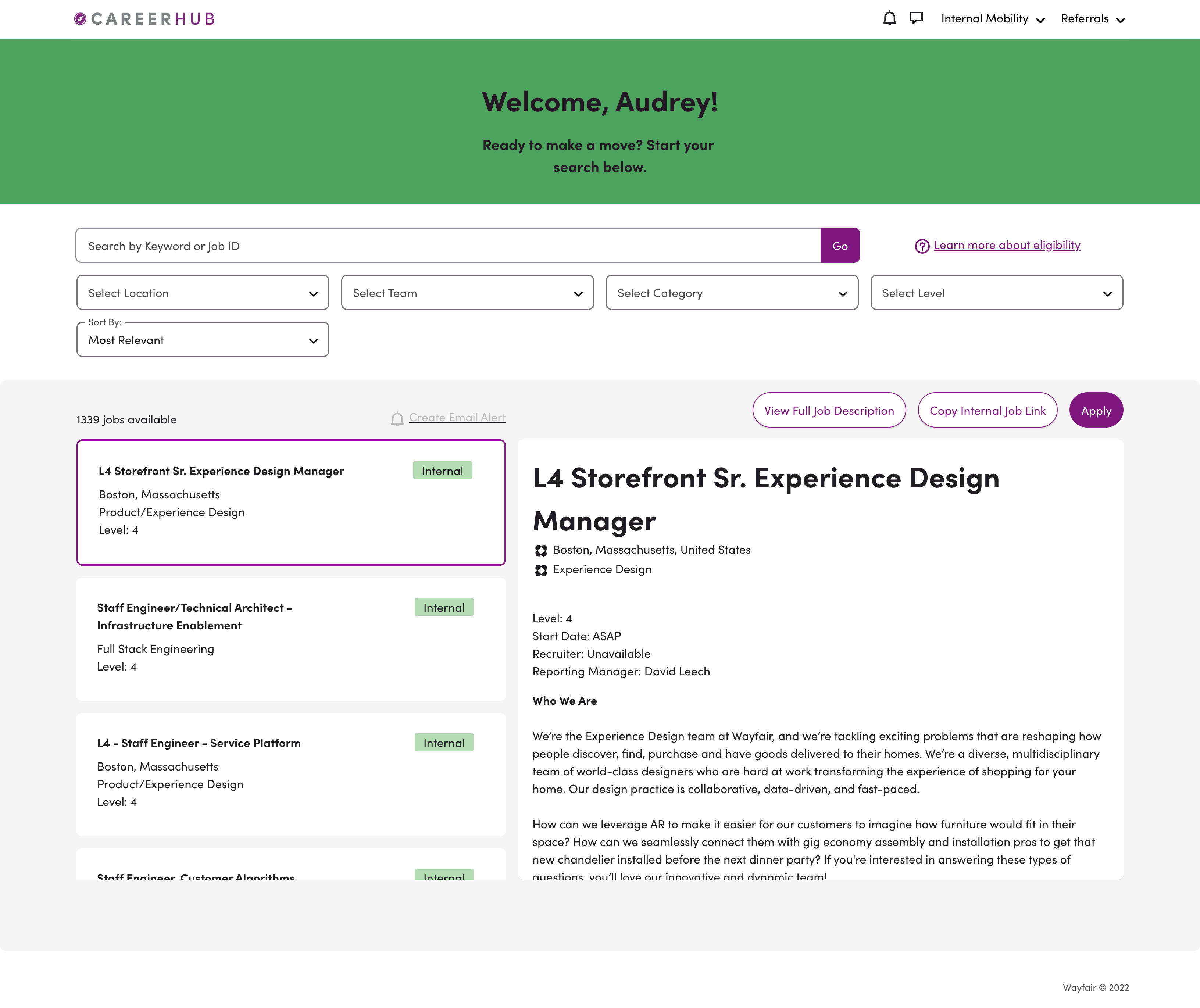
The internal mobility and referral application are placed on modals.
This is a major usability issue as applications are the core experience of the hub. This was a problem across all devices.
Modal Applications on both mobile and desktop devices
Through usability testing, all users expressed a strong desire for absolute certainty when applying for a new internal role.
They encountered several frustrations with the application process mainly due to the modal:
• Users couldn't view the job description screen after clicking "apply" due to the modal blocking the screen, causing uncertainty.
• The small application form within the modal limited the information displayed on the screen, requiring 6-9 scrolls to complete the application.
• Most users were unpleasantly surprised that closing the modal resulted in losing all application progress.
• Users found it inconvenient that there were no quick exit options, as the exit button was located at the top of the modal. In the case they wanted to cancel the application or encountered submission issues, it requires 6-7 scrolls to reach the button.
Transforming Problems into Goals
After identifying specific pain points, I transformed them into four goals in order to come up with the best solution for our problem at hand.
Goal 1
Users can return to view any previous screens after clicking on the application
Goal 2
Users should easily be able to complete an application in the least amount of steps
Goal 3
Users can revisit their progress on an application even after leaving the page
Goal 4
Users should easily be able to complete an application in the least amount of steps
IDEATE
Brainstorming Solutions
My teammate and I jumped on a call to brainstorm. There were ideas floating around such as increasing the size of the modal, separating the information into modals, placing the application form onto a full screen, and placing the exit button next to the submit button on the bottom of the page.

Sketches + Ideation chart that my teammate and I used to brainstorm
But all these ideas only solved part of the user problem. I came up with the idea to transform the application form from a modal onto a new screen that opens in a new tab. This option was chosen as the basis for the final design as it addressed all four goals.

Winning Solution!
Final desktop solution
Placing application forms onto a new screen that opens in a new tab

1. View the corresponding job description by switching tabs
↳ If users have doubts when applying to new roles, they can easily access the relevant job description
2. Refer back to the CareerHub portal without deleting progress on the application
↳ Users can freely switch tabs knowing that the application will not let their hard work disappear
3. Complete the application in 3-4 scrolls as there is a larger container to display questions
↳ Displaying more information at once will allow users to complete tasks in a smaller time frame
4. Quickly exit the application simply by closing the tab
↳ Users can quickly exit the application if they encounter an edge case (e.g. no longer needed, submission fails)
Final mobile solution
There is more friction switching between tabs on mobile and tablet browsers than on desktop

On mobile browsers (Chrome, Safari), tabs are hidden until users manually open the tab selection menu. Users have to consciously switch between the two tabs if they want to refer back to the job description.
Solution: Include the job description at the beginning of the application by hiding it in a dropdown to allow users to access job description on the same page.
Designing Screens for Breakpoints and Edge Cases
To help ensure that the new application design is optimized for different screen sizes and devices, I built out the designs reflecting breakpoints for all devices. This also helped engineers easily understand how to build out the designs adaptively.

I considered how the application form would behave in certain error or failure situations, so I designed for multiple edge cases that were missing on the previous modal application.

Final solutions
Implementing a new consolidated navigation menu and optimizing application forms for a full-screen experience

One of the core improvements of is the implementation of a new consolidated navigation menu that simplifies the browsing process, ensuring users can effortlessly navigate the website. This intuitive menu system categorizes options logically, providing clear pathways to internal job listings and referral submission forms.
Secondly, the application form has been optimized for a full-screen experience. This design choice maximizes the use of screen real estate to ensure that all relevant information, including job descriptions and requirements are presented with clarity, reducing the need for excessive scrolling and enhancing overall readability.


%20(1).gif)