Designing a Smarter Exception Resolution System

Enterprise Tool

0 to 1

Product Thinking

Information Architecture

Interaction Design

ROLE
Product Designer

PLATFORM
Web application on desktop

TIMELINE
Oct 2024 - Jan 2025

TEAM
2 Designers, 2 Product Managers, 1 Product Director, 4 Engineers

overview
Conservice, the nation’s largest utility billing company, relied on 130+ legacy tools that slowed employees, introduced errors, and frustrated customers

Current softwares employees are using to complete daily work

Our team built Portal, a unified web platform that replaces dozens of outdated systems with a single, role-based experience
Instead of managing countless outdated applications...we now have a single, dynamic platform tailored to each user’s role and needs, with a personalized dashboard that adapts accordingly.
project highlight
As part of this transformation, I led design for the Exception Resolution System - one of Portal’s first and most critical workflows
CHALLENGE
Exception analysts handled billing errors across five different tools, manually piecing together data just to resolve one issue. This fragmented workflow caused inefficiencies, confusion, and costly delays.
SOLUTION
A unified workspace that surfaces key data, supports multitasking, and mirrors real behavior, which streamlined exception handling from a disjointed, reactive process into a fast, contextual, and user-centered experience!

Snippet of the exceptions application

IMPACT
Reduced time spent per exception, minimized errors, and improved clarity across teams...leading to faster billing cycles, lower operational overhead, and higher confidence in data accuracy
MY ROLE: PRODUCT DESIGNER
I shaped the experience from discovery to delivery: mapping information architecture, creating user flows, and aligning cross-functional teams around user-first decisions
context
An exception occurs when a utility bill requires manual review due to anomalies, like a sudden, unexplained spike in cost
👀
Example: A commercial property usually pays around $5,000/month, but one month the system flags a $50,000 charge. The bill is paused for human review until an analyst verifies or resolves the discrepancy.

The "dashboard" an exception analyst uses to view and work on their daily tasks

Exception analysts rely on a dashboard to review, validate, and resolve these issue
Conservice manages 11 types of exceptions, each triggered by specific business rules. For billing to proceed, analysts must clear each exception accurately and efficiently.
business goals
Addressing exception workflows is critical to achieving core business objectives:
💡
Build Client Trust
Accurate, timely billing improves transparency and strengthens relationships with property managers and tenants
⚙️
Improve Operational Efficiency
Reduce time spent on manual tasks, eliminate false positives, and streamline cross-team collaboration

Ensure Data Integrity & Accuracy
Establish a structured QA process to catch the right exceptions, reduce errors, and avoid costly rework
research
To begin understanding current workflow and behaviors, we conducted user interviews with 10 exception analysts
During these sessions, I documented key pain points, recurring workflow inefficiencies, and opportunities for streamlining. Through synthesis, I created:
1.. A detailed task flow map outlining the 11 different types of exceptions and how analysts navigate and resolve them.
2. A user persona that captured the goals, frustrations, and behaviors of a typical analyst to give the broader team a shared understanding of our primary user.
"I’m constantly jumping between five tools just to figure out what’s going on. It slows everything down.”
Goals
• Resolve exceptions quickly and accurately
• Minimize back-and-forth communication with other departments
• Ensure billing errors are documented clearly and don’t recur
Frustrations
• Constantly toggling between multiple tools to gather info
• Duplicate or overlapping cases create confusion
• No clear prioritization or progress tracking
• Rigid systems force manual workarounds
Motivations
• Wants a single, clear workspace that saves time
• Values clarity and transparency in workflows
• Wants to focus on solving issues, not fighting the system
key user problems
1. Analysts struggle with a fragmented workflow and tool overload
Analysts use 4–6 different tools to resolve a single exception:

System health to view their tasks and open up bill images

Google docs for notes to streamline their personal workflow
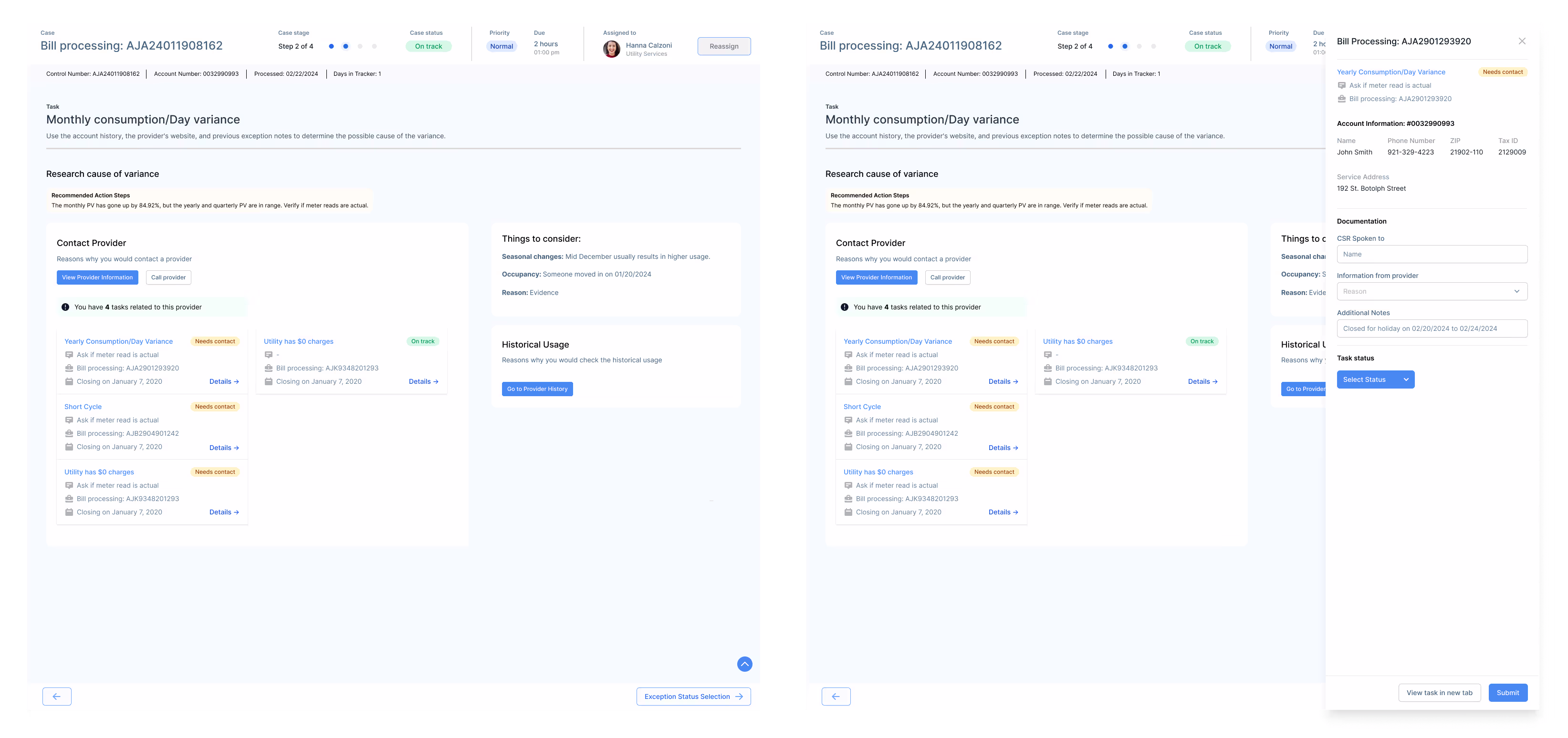
💡 Constant context-switching slows decisions, increases errors, and makes focus nearly impossible.
2. Analysts face challenges due to irrelevant and disorganized information
The current tools surface too much data, most of it unrelated to the issue at hand. Analysts waste time reordering dashboard columns or searching across tabs to find what matters.
💡 The system treats all employees the same, ignoring the specific needs of exception analysts.
insight
Our research made one thing clear: analysts weren’t struggling because they lacked skill...they were fighting a fragmented, tool-heavy environment that buried critical information.
Prioritization
With leadership already aligned on the business need, our focus shifted to validating the right MVP experience
We used user interviews and workflow observations to ensure we were addressing analysts’ most frequent pain points.

From there, we streamlined core tasks (validate, investigate, resolve, and report) into one cohesive flow. We aimed to eliminate reliance on external tools, reduce errors from context switching, and build a clear foundation for future automation and workflow visibility

Partnering closely with PMs and engineering, we prioritized the highest-impact features we could realistically ship in our MVP.
ideation
Explored multiple approaches to map out the IA and user flow, each one bringing us closer to a system that made exception resolution not just faster, but intuitive
With an overwhelming amount of data to scour through, these methods helped us cut through the noise and find clarity.
explorations
Brainstorming designs and ideas, iterations
With the IA and flows established, we rapidly iterated on mid-fidelity designs focused on core workflows and task efficiency.
Our goal was to prove the concept quickly, test assumptions, and refine continuously based on feedback.
Here are some mid-fi explorations of my focus areas during these designs:
Defining the UI of the application
With so much information and ample space for displaying actions, I focused on establishing a clear hierarchy and layout. The key requirement was integrating the exception workflow within the pre-existing case management structure, ensuring consistency while optimizing data presentation and task accessibility.
I applied a progressive disclosure design approach since there were distinct stages identified in the exceptions workflow. I prioritized displaying only the essential information and actions needed at each step, ensuring visual clarity and reducing cognitive load for analysts.
Focusing on: Enhanced Data Visibility
Building on the progressive disclosure pattern, I incorporated feedback by adding missing information, a detailed bill data breakdown for the initial quality check, and additional meter-related details to support more comprehensive bill analysis.
Exceptions Application
Companion Application
User research revealed two distinct tasks: analyzing and reporting. To streamline these workflows, I proposed a companion application that analysts could use alongside the main app, leveraging their dual-monitor setup.

This allows users to reference the control bill while continuing their task without switching between screens. We integrated this approach with the progressive disclosure pattern and proceeded to test the design.
Designing a Streamlined Bill Research Companion App
The primary purpose of the companion application (which we've dubbed the bill research application) is to support analysis with minimal user interaction. By limiting actions within this app, we aim to streamline workflows and ensure it can be repurposed for other research tasks in the future.
The control bill data associated with the task remains fixed on the left side of the screen, while bill history, provider information, and account details appear as users select each section. Version 1 was designed based on assumptions about analysts’ needs, derived from interview insights.
Incorporating feedback from SMEs, I streamlined features to balance functionality and development efficiency. Instead of breaking down bill history, I included the full table for quicker implementation. For provider profiles, I displayed only the sections essential to exception analysts. Additionally, I added account verification information to support phone calls with providers.
The final version featured improved visual design and clearer data hierarchy for easier navigation. After discussions about privacy, sensitive data required PIN entry for secure access. Analysts can seamlessly switch between viewing bill data and bill images, offering flexibility based on their workflow needs.
Handling notes and communication within teams and with external clients
We needed to work through how to document what is happening with the exceptions and how to communicate with clients when needed.
Initially, documentation and client communication were treated as separate steps in the progressive disclosure flow. However, user feedback revealed they are closely linked.
The existing notes section allowed analysts to enter unstructured text in any format. To create a more organized and uniform approach across Portal, I restructured it by limiting note options to predefined categories, including common actions taken, issue types, and issue details. On this slideover, analysts are also able to customize messages to clients as it would be a part of the documentation process.
Restructured the slideover to align with updated user flows. Rather than including related tasks within the same view, I prioritized documentation specific to the task at hand for better focus and clarity.
Optimizing for Multitasking: Enhancing Workflow Efficiency
Analysts often juggled multiple tasks at once which was a key workflow behavior I initially overlooked. Through research and iteration, I refined the design to better support their multitasking needs.
Alongside notes, the first version introduced a quick close feature for tasks within the same case and bill, addressing the system’s tendency to generate multiple tasks for a single issue
However, we quickly realized that analysts handled multiple tasks in various ways. I identified three key categories: tasks related to the provider, tasks related to the case, and tasks related to the account, with each requiring distinct resolution flows.
Through deeper analysis of the workflow, I observed that analysts often group tasks by provider. They handle multiple accounts in a single phone call to improve efficiency. This insight informed design decisions to better support task stacking and streamline communication with providers.
refine
Before launching the MVP, we conducted usability testing with 5 exception analysts to ensure the designs worked for real workflows
🌀
Analysts work non-linearly
They jump between sections instead of following a strict step-by-step flow
💡
Surface all key info at once so analysts can scan and act without losing context
🌀
Multitasking is essential
Analysts juggle several cases while waiting on client or provider updates
💡
Enable automatic syncing across open tasks to reduce manual switching
🌀
Bills must be easy to compare
Distinguishing between multiple bills was a frequent struggle
💡
Use side-by-side layouts, color coding, and visual cues to clarify differences at a glance
🌀
Adopting new tools takes time
Analysts have used legacy systems for years and need reassurance
💡
Add onboarding prompts, tooltips, and contextual guidance to support gradual learning
Outcome
Analysts were open to the new system but cautious. By keeping their familiar workflows intact while improving speed and clarity, we built early trust. Weekly feedback loops with engineering helped us refine quickly and resolve major usability issues before launch.
solution
We built a user-centered, scalable application that adapts to how analysts actually work... not how legacy systems forced them to.
Through restructuring user flows and prioritizing essential features, we streamlined their tasks for greater efficiency. Beyond solving analysts’ pain points, this solution established a scalable foundation for handling high-volume tasks within Portal.

The features highlighted below focus on solving for user problems we identified above:
By introducing a supplementary application, exception analysts can easily differentiate and prioritize relevant information

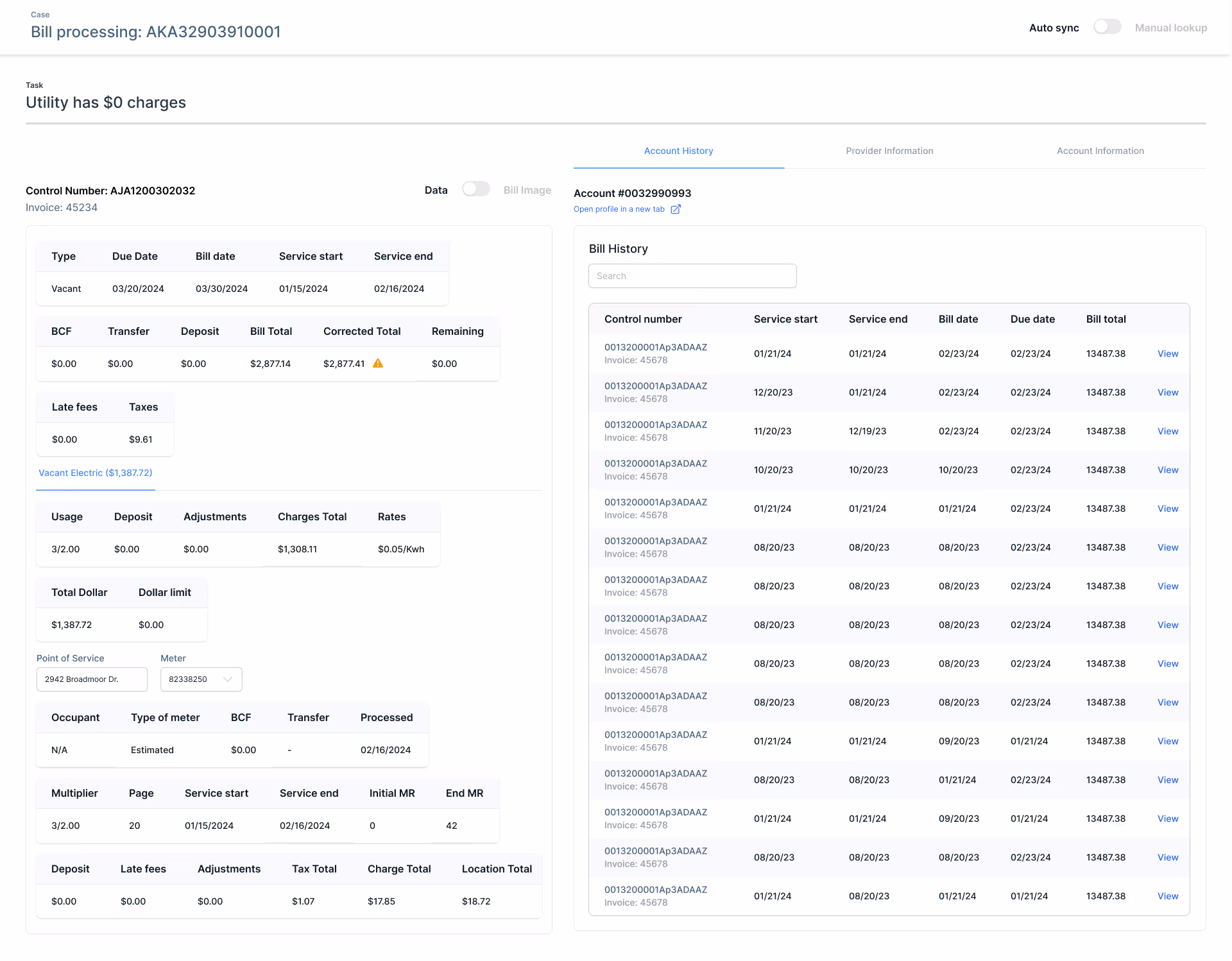
Analysts can access the account’s bill history and select a specific bill for comparison

Analysts can toggle between the bill data breakdown and the actual bill image, and they can do the same for the comparison bill

Analysts can view provider contact information tied to the specific case

Analysts can quickly access the required information to verify their identity when contacting a provider

Impact 🎯
🤓
Enhanced Accuracy & Visibility
Implemented a structured exception-handling approach that improved bill accuracy by 35%, reduced incorrect flags by 50%, and lowered the number of unnecessary rework cases by 40%
⛓️💥
Improved Operational Efficiency
Cut manual tasks by 30%, sunset 2 legacy applications, reduced exception handling time by 20%, and shortened new analyst onboarding time by at least 1 year (projected)
📏
Made workflows measurable
By centralizing tasks in one system, we enabled full visibility into analyst workflows for the first time. This data is now driving smarter product decisions and paving the way for automation!
🧠
Established Design as a Strategic Partner
Advocated for design as a key driver of operational improvements, influencing product roadmaps and securing buy-in for three additional design-led initiatives focused on efficiency and scalability
Takeaways
Given the tight timeline and evolving design system, our focus was on functionality and efficiency
If revisited, I’d invest more time in visual refinement and future iterations would emphasize visual polish and design cohesion.
Designing for expert users
Understanding analysts’ specialized workflows was key to creating a system that feels natural and empowering.
Making use of limited resources
A small team and minimal user access demanded strategic prioritization and close collaboration.
Back to Top
ADDITIONAL projects
I delivered integral products across multiple product portfolios
Beyond the Exceptions App, I played a key role in shaping Portal’s ecosystem. I delivered products that unified legacy tools, streamlined operations, and improved design consistency across Conservice. These projects laid the groundwork for scalable, user-centered experiences across the company.
Portal Foundation: Task DashboardBuilt an enterprise workload management interface — led tagging system, IA, and task flow design
Flag Manager AppConsolidated error detection across bill data, replacing manual Google Sheets tracking
Configuration ToolsStreamlined property updates and funding requests, replacing fragmented Excel-based workflows
User researchLed discovery sessions across 10+ employee groups to inform cross-platform design needs

Thanks for being here. ٩(。•́‿•̀。)۶

⤹˚˖ ୭ Home page
National Geographic °˖➴