define
Heuristic evaluation reveals that the site does not adhere to design standards
The research team and I identified several usability issues with the site and also cited recommendations going forward.
Snippets of Heuristic Evaluation
I conducted user interviews with associates to understand how they interact with the ZLTS
I led 10 user interviews: 5 associates that have used the site before and 5 associates who have not. This helped me uncover pain points from different POVs.

An important insight noted was that it seemed like users rarely used the ZLTS. Users were either unaware of the site or stated they didn't need to use it as they are already familiar with Zoom.
I echoed these concerns to the team, and it was decided that this was more of a business need than user need. We continued with the redesign, setting the goal of creating an intuitive site that is free of all UX issues and easy for users to navigate if ever needed. Additionally, this website could be used as a template for future LinkedIn Learning partnerships.
Considered other learning platforms through conducting a competitive analysis to drive design decisions

Through affinity mapping, I found that the user problems of the ZLTS boils down to three main pain points:
1. Content is dense and unorganized 📚
Information is overwhelming and uses many unfamiliar technical and inconsistent terms.
2. Limited understanding about the system ⚙️
Information presented does not effectively guide novice users through core tasks. Users aren’t able to differentiate between modules.
3. Disjointed Navigation 🗺️
Users aren’t able to quickly search for modules and lessons. The navigation is not intuitive; users have to remember what each term means to get to their destination.
ideate
Developed a user flow to provide a foundation of content needed and the path users would take to complete a task
Not only did this provide structure, but stakeholders and others removed from the project could also refer to this flow and immerse themselves in the user experience.

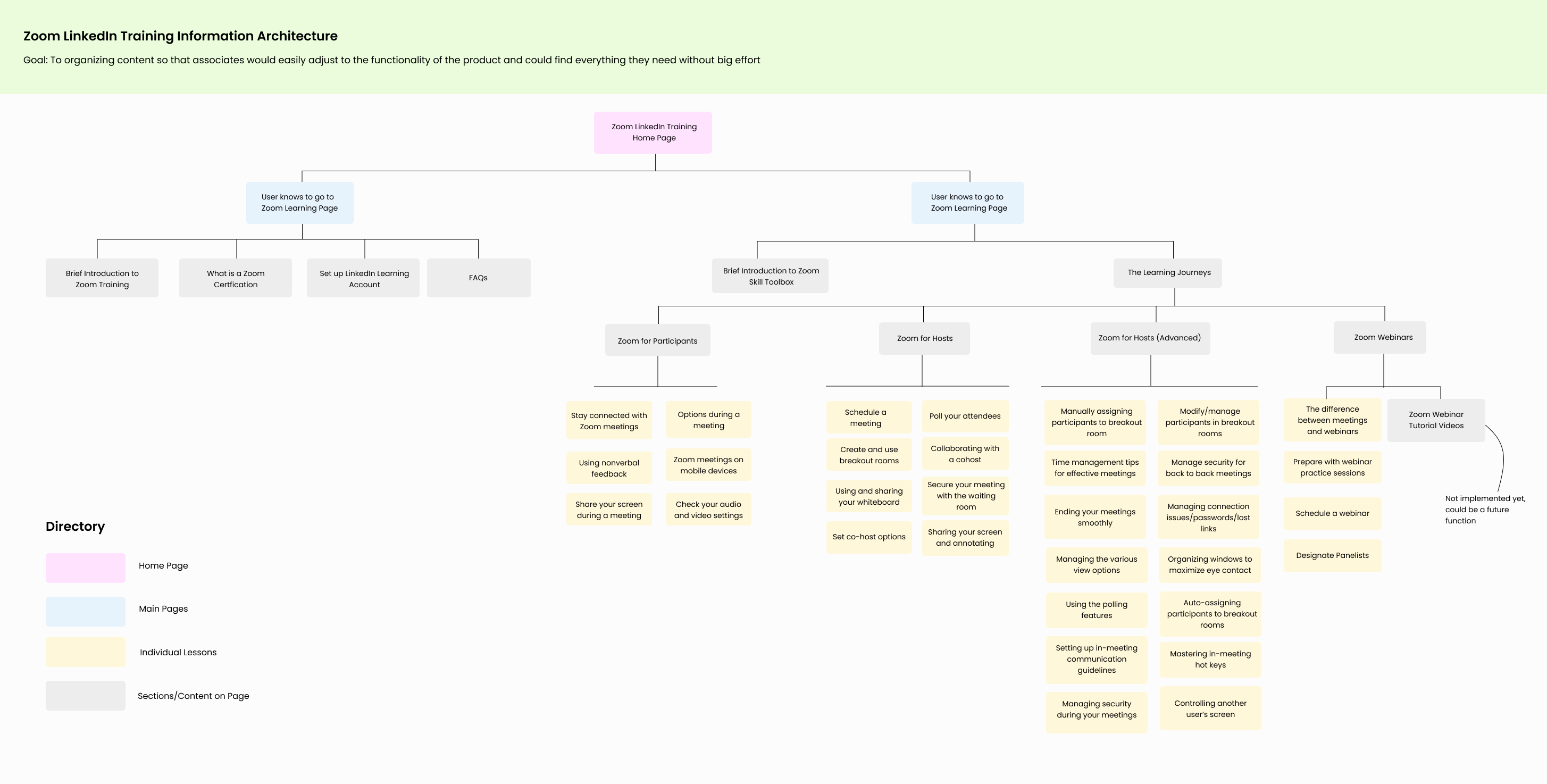
Restructured information architecture to understand how users would navigate to different pages from the homepage and the breadth of the redesign
There were no major changes except the decision to combine the Skill Toolbox Page and Learning Journeys Page (LJ Page) into one individual page in order to:
• Eliminate Repetition: the LJ Page only had redundant information
• Withdraw Ambiguity: at first-glance, novice users were unclear what "learning journeys" were on the homepage
• Remove Extra Time: the LJ page's only function was that it acted as a fast path to the Skill Tool Box Page
Created mid-fi screens of possible solutions
I was limited to WEM design components and had to ideate solutions based on what was possible when building the site in WEM.

REFINE
Conducted unmoderated usability testing through UserZoom
I created a research plan reviewed with stakeholders and aligned on the scope of the redesign. I established a series of tasks for participants to perform to measure task success rate.
The main goals of this testing session were to:
• Compare two initial designs of Zoom Skill Toolbox Page
• Assess whether content is clear and easy to understand
• Gauge successful task completion of important tasks (finding lessons, quick links)
• Understand if the information architecture improved findability of content


.jpg)

