Design System
Visual Design
Strategy
Documentation
Token Management
ROLE
UX Designer (Contract)
PLATFORM
App, Mobile Web, Desktop Web, Kiosk
TEAM
Design Systems Lead + Me
XFN: UX, Eng, PM, Brand
TIMELINE
Jul 2025 - Feb 2025 (Updated: Dec 2025)

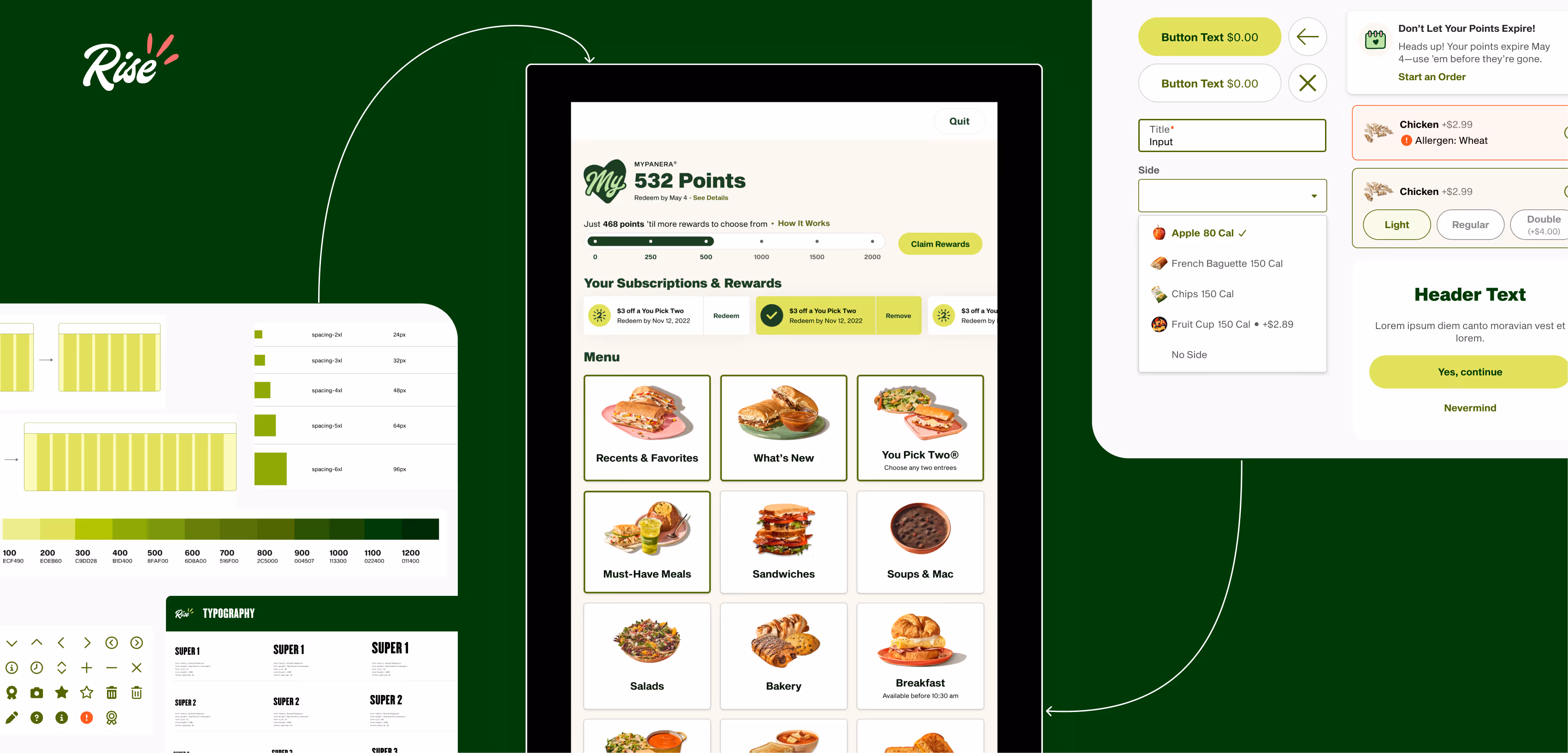
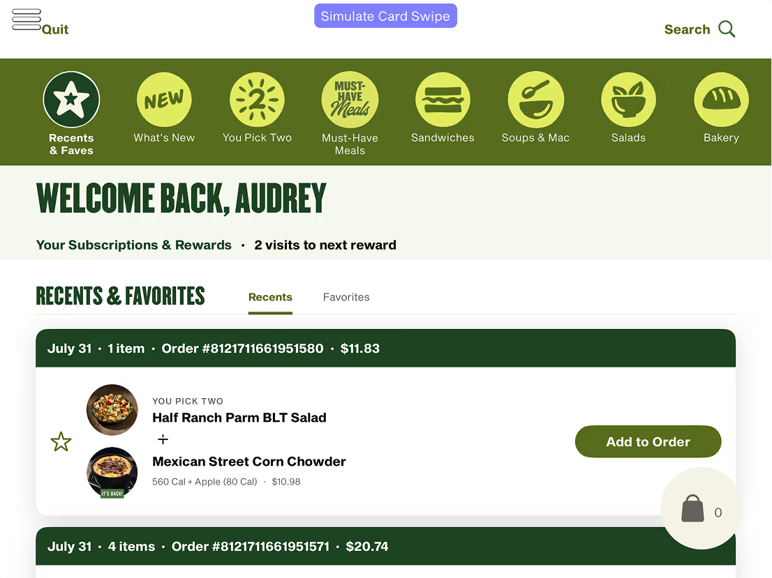
Web
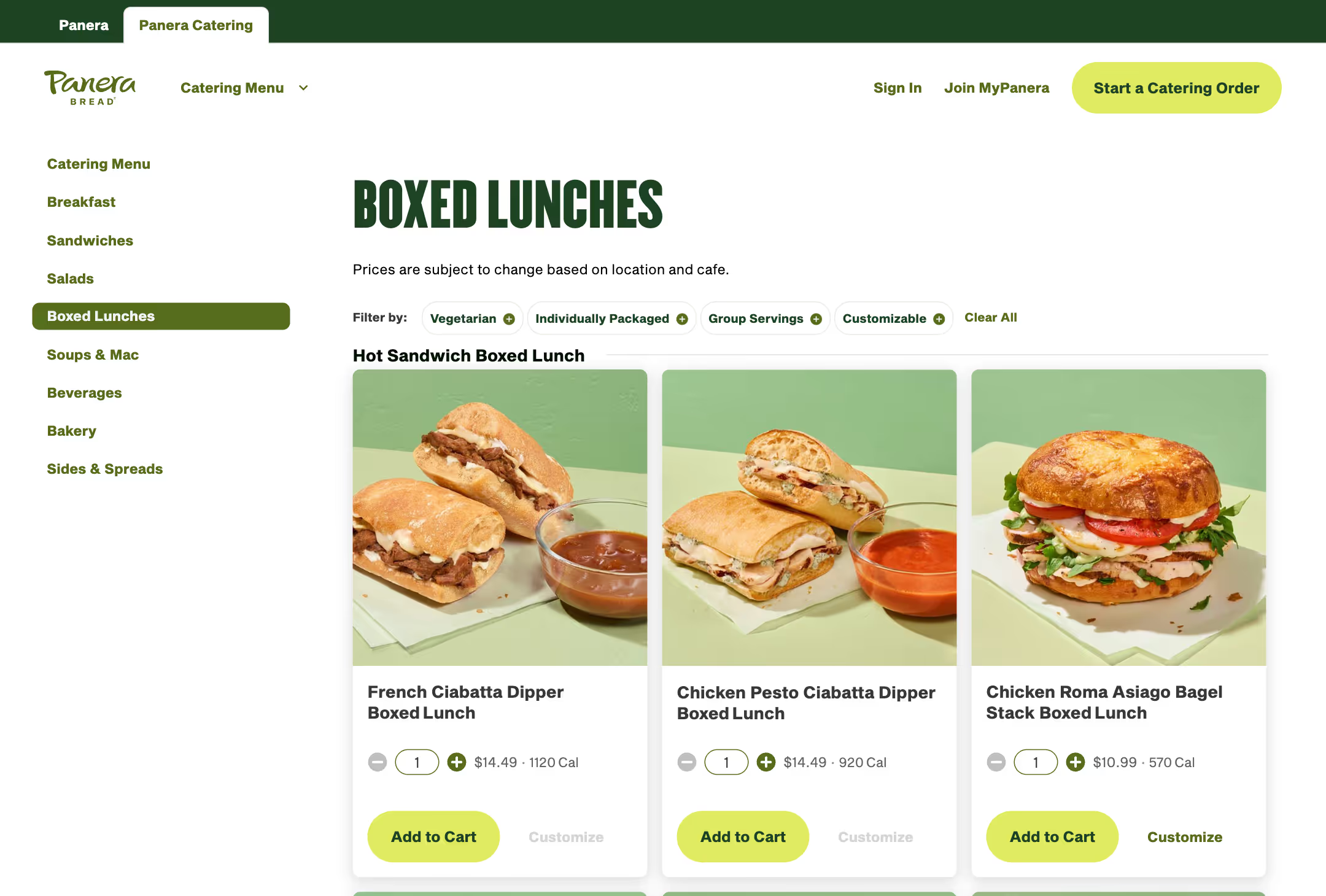
Catering
In-store kiosk
.avif)
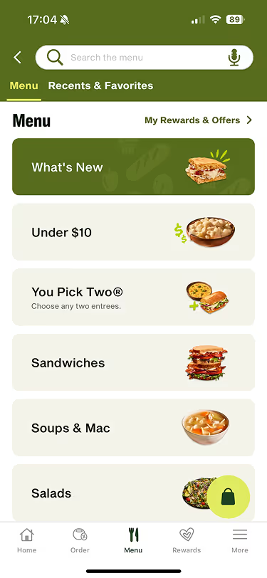
App
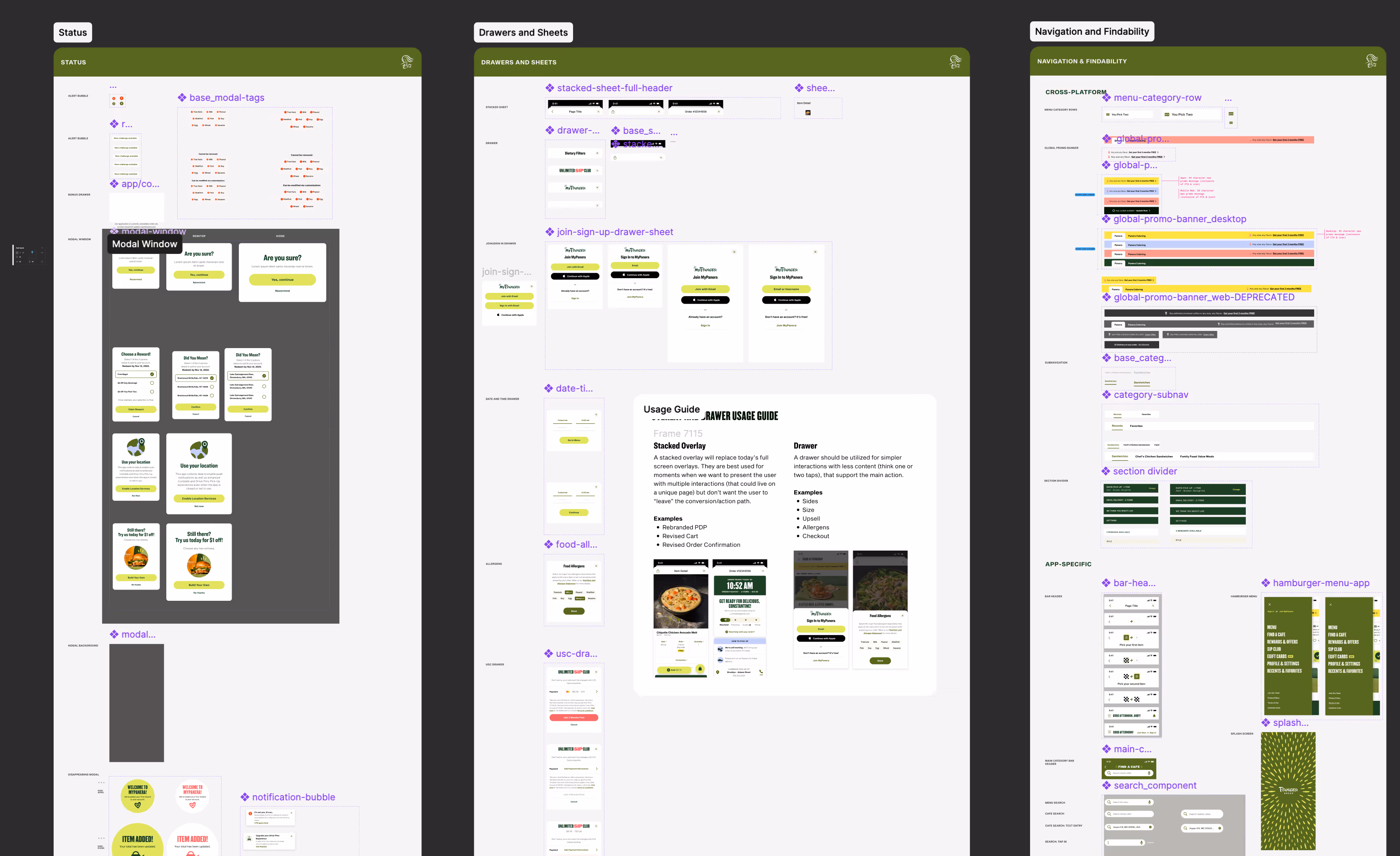
Current pattern library with components without loose usage guidelines, no foundations, and unorganized components

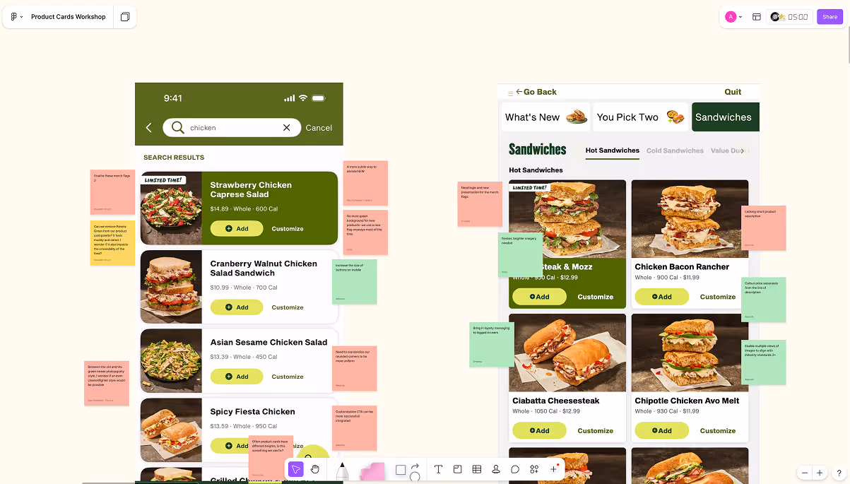
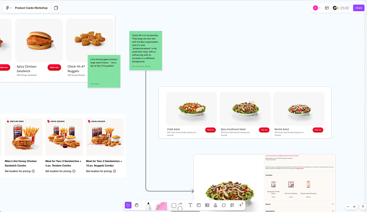
A product card workshop I led

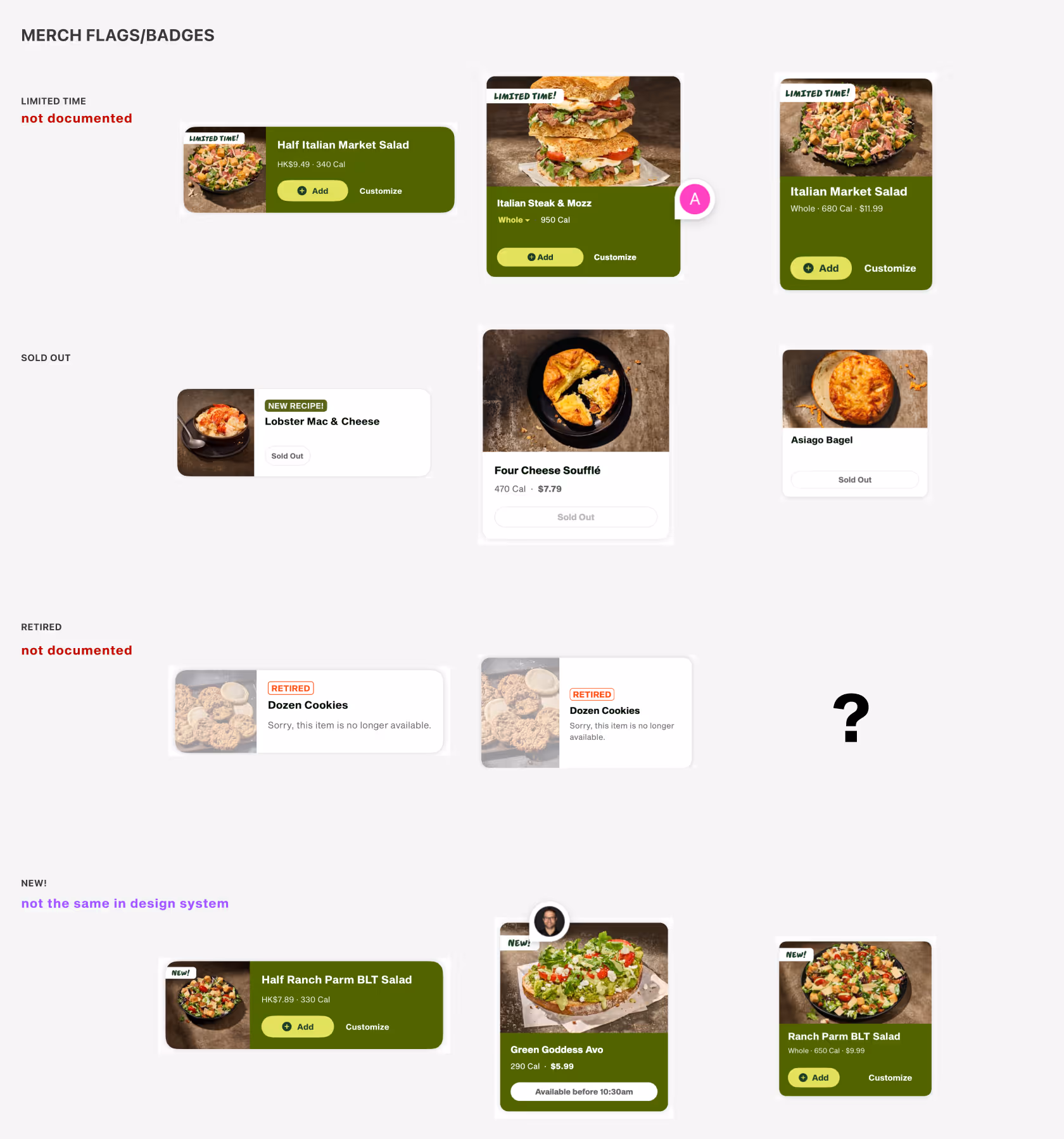
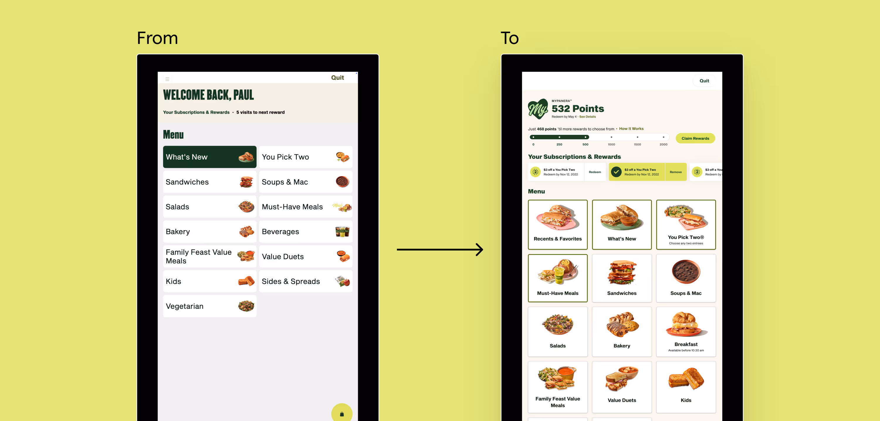
Initial Product Card Audit of what's currently live

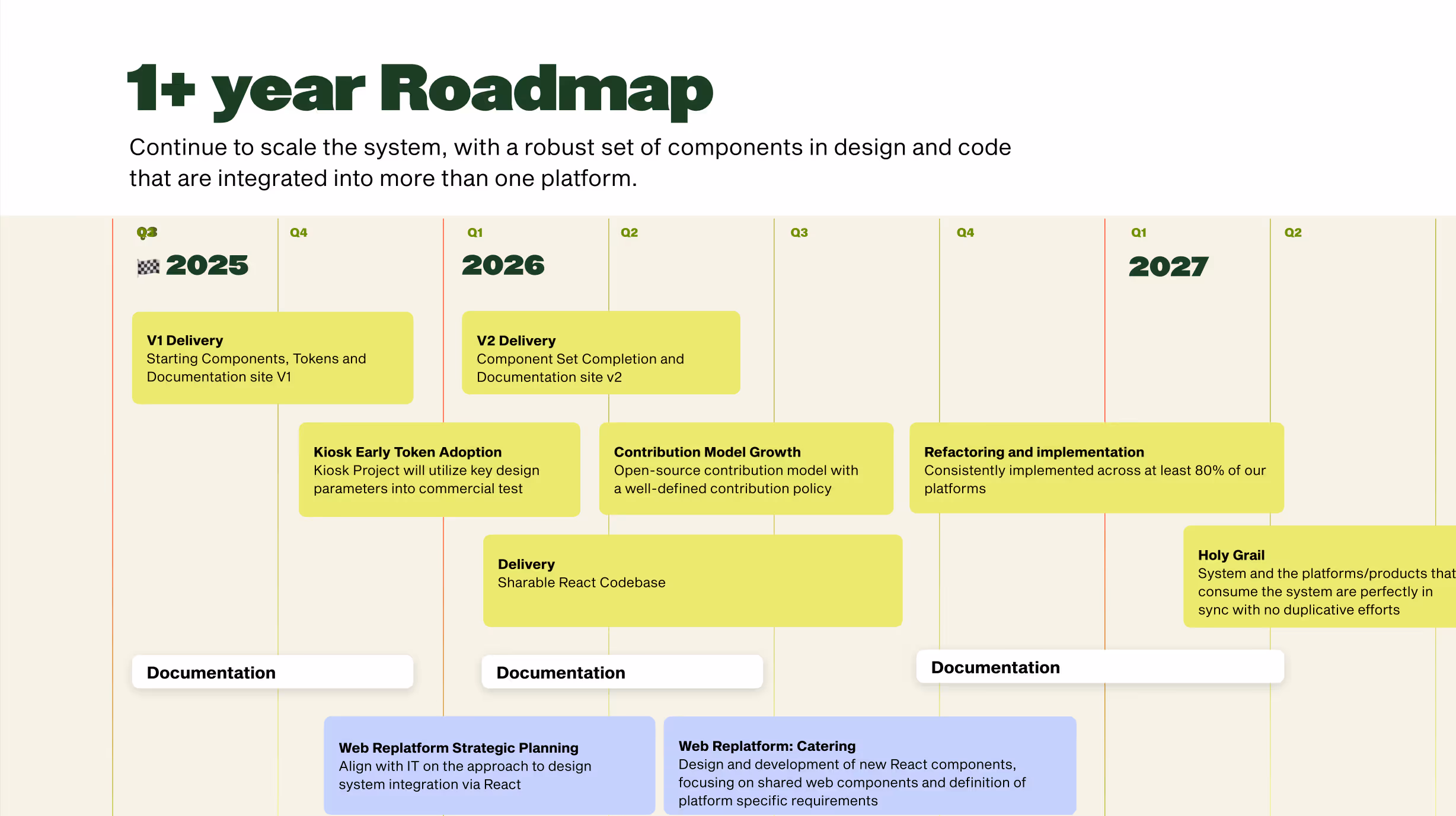
Slide from progress update to our business stakeholders (Dec 2025)

E.g. sifting through different DS documentations to understand the current state that we can borrow from

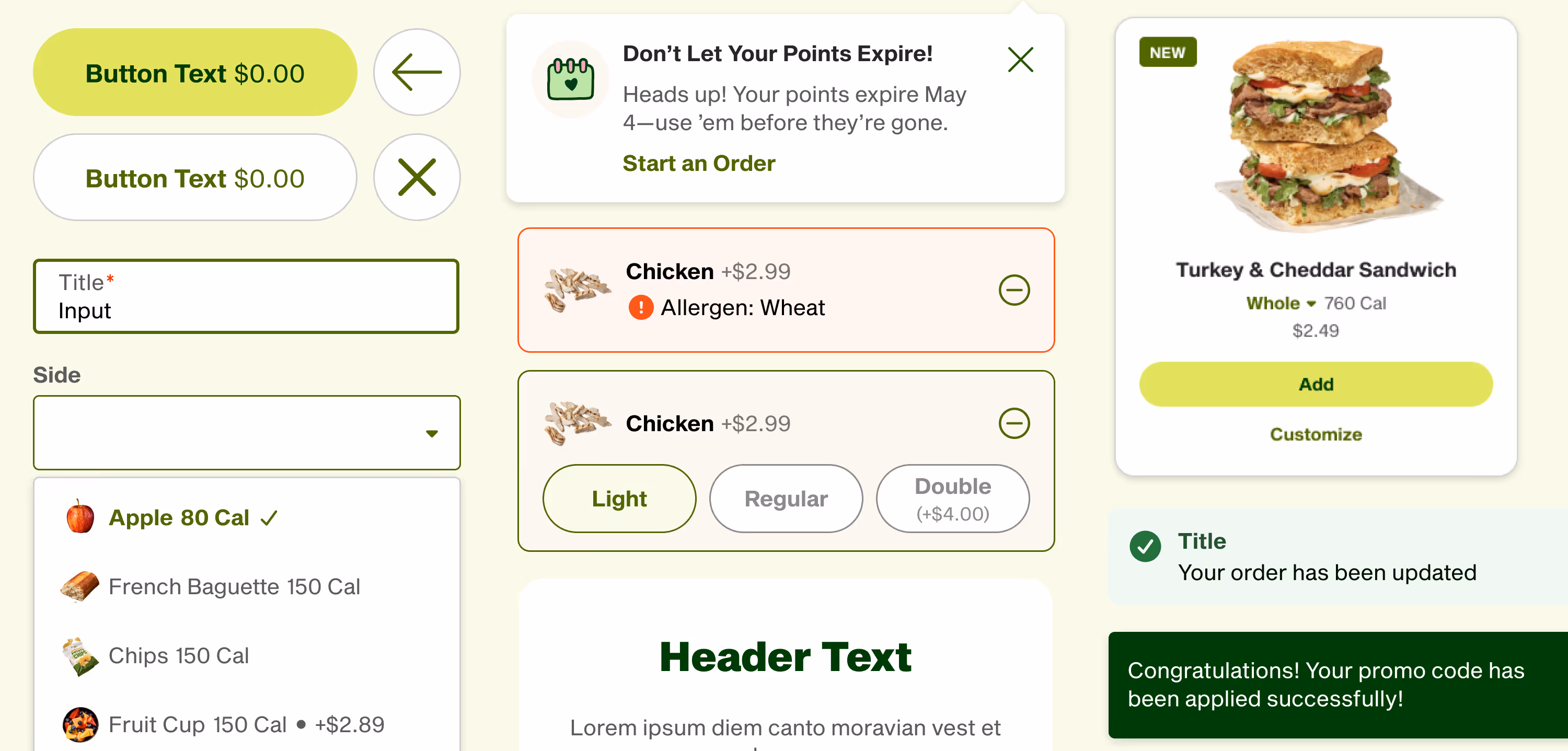
E.g. in ingredient customization selector, pill button sizing and icon scale were intentionally adjusted to support both min and max screen sizes while preserving usability and visual consistency

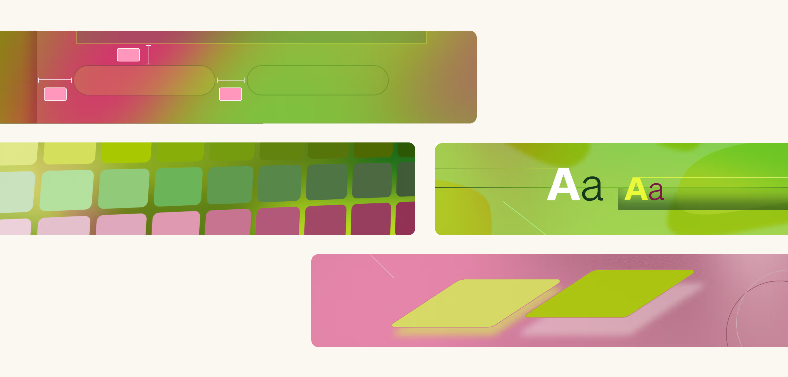
E.g. carefully selecting colors on digital for accessibility that still reflected the brand identity

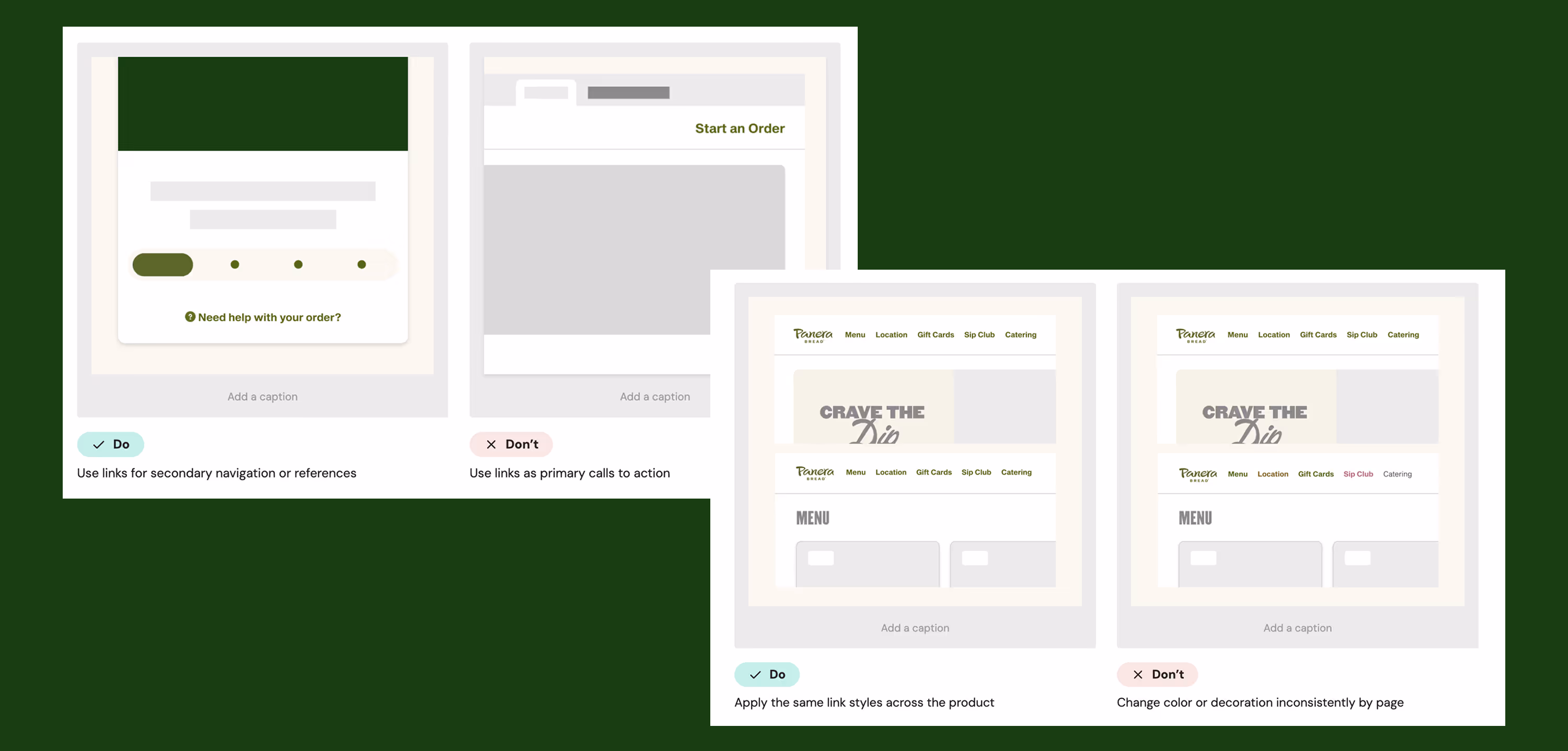
I created over 50+ visuals to help visualize common mistakes teams can make when using the DS
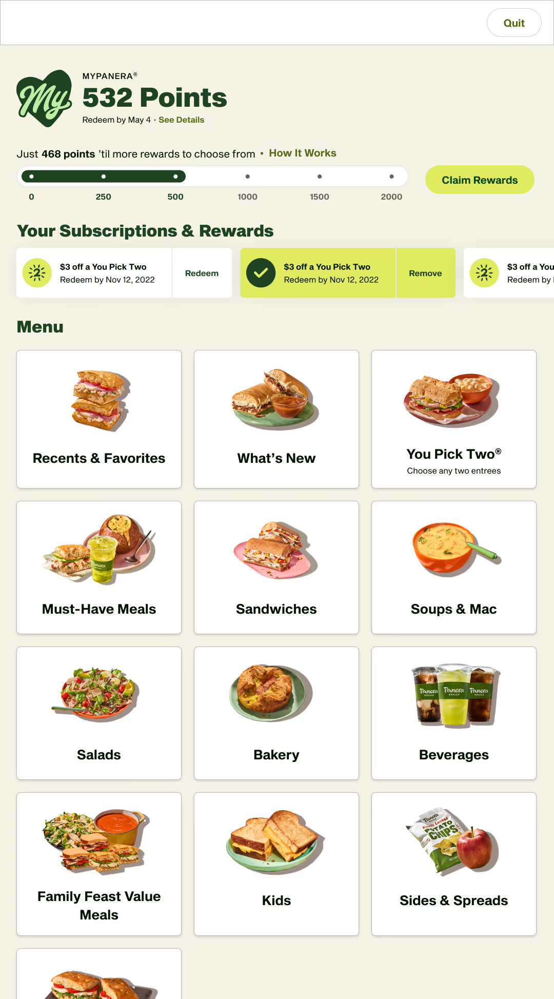
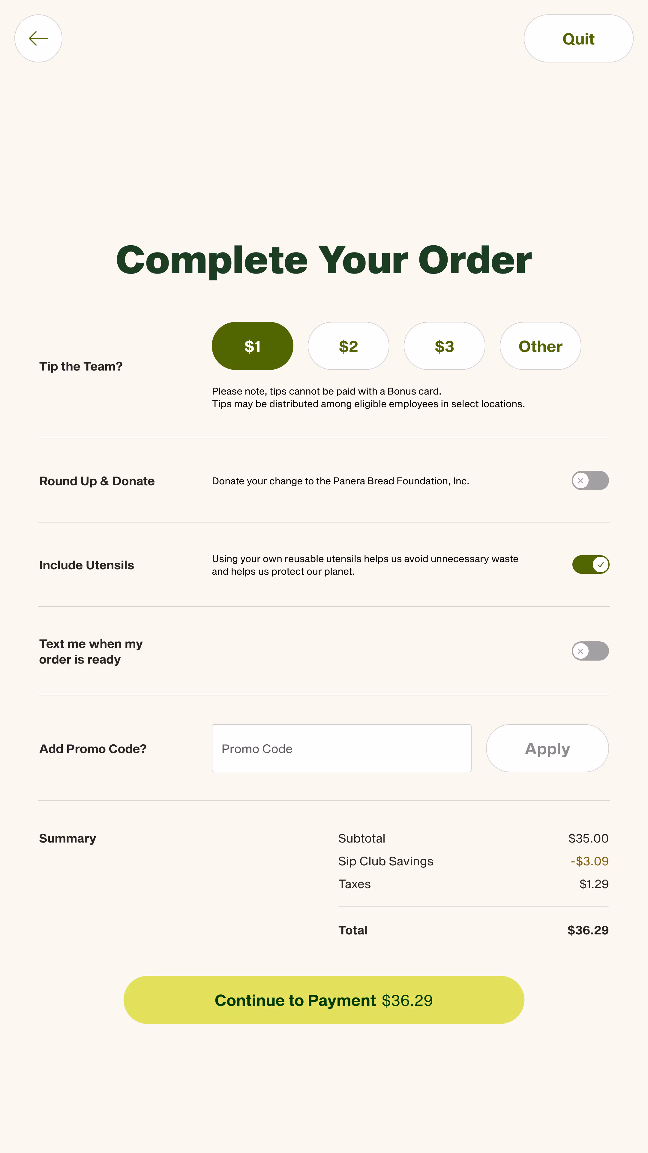
New designs using our foundations + components, designed by the kiosk replatforming team
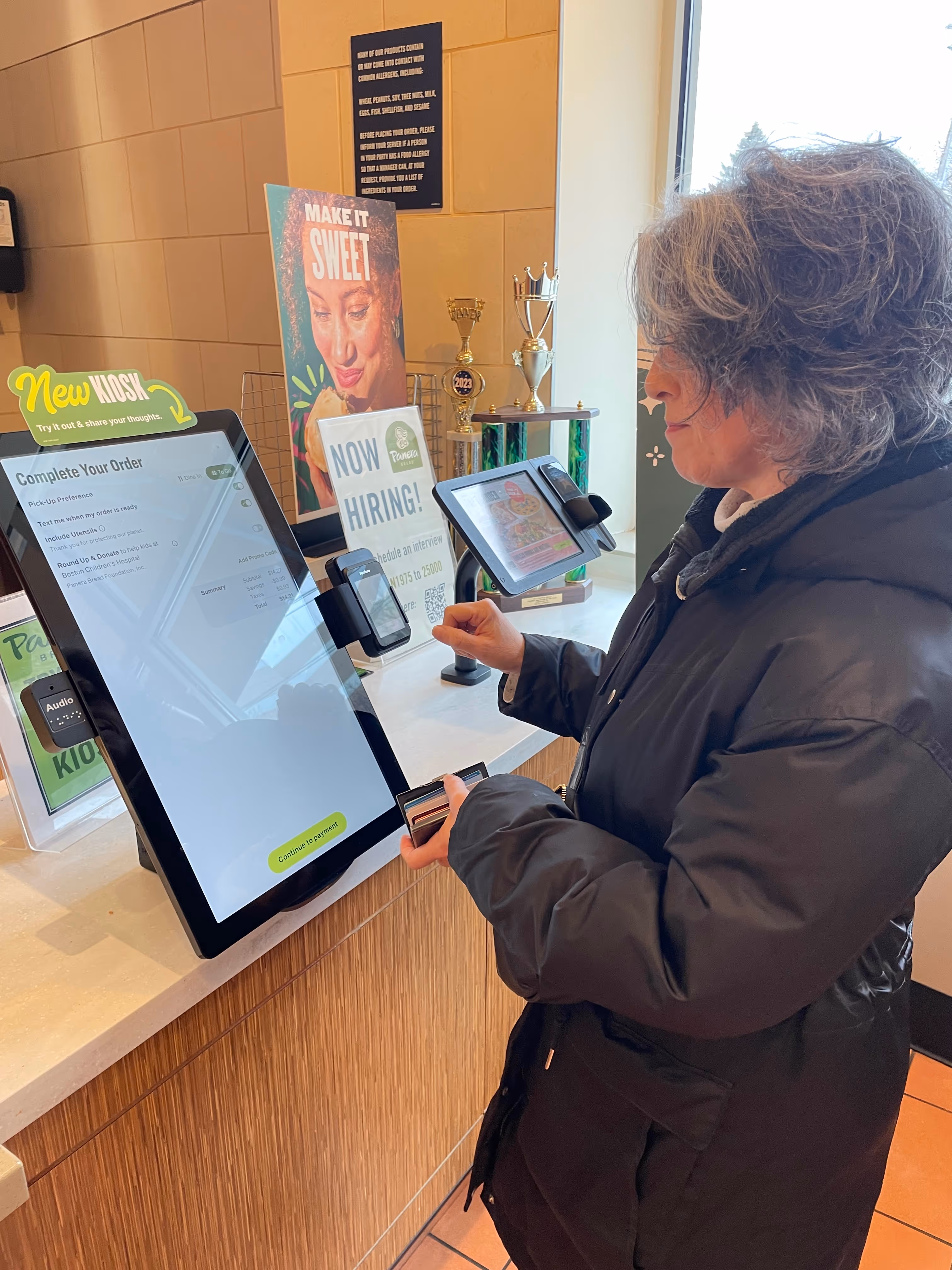
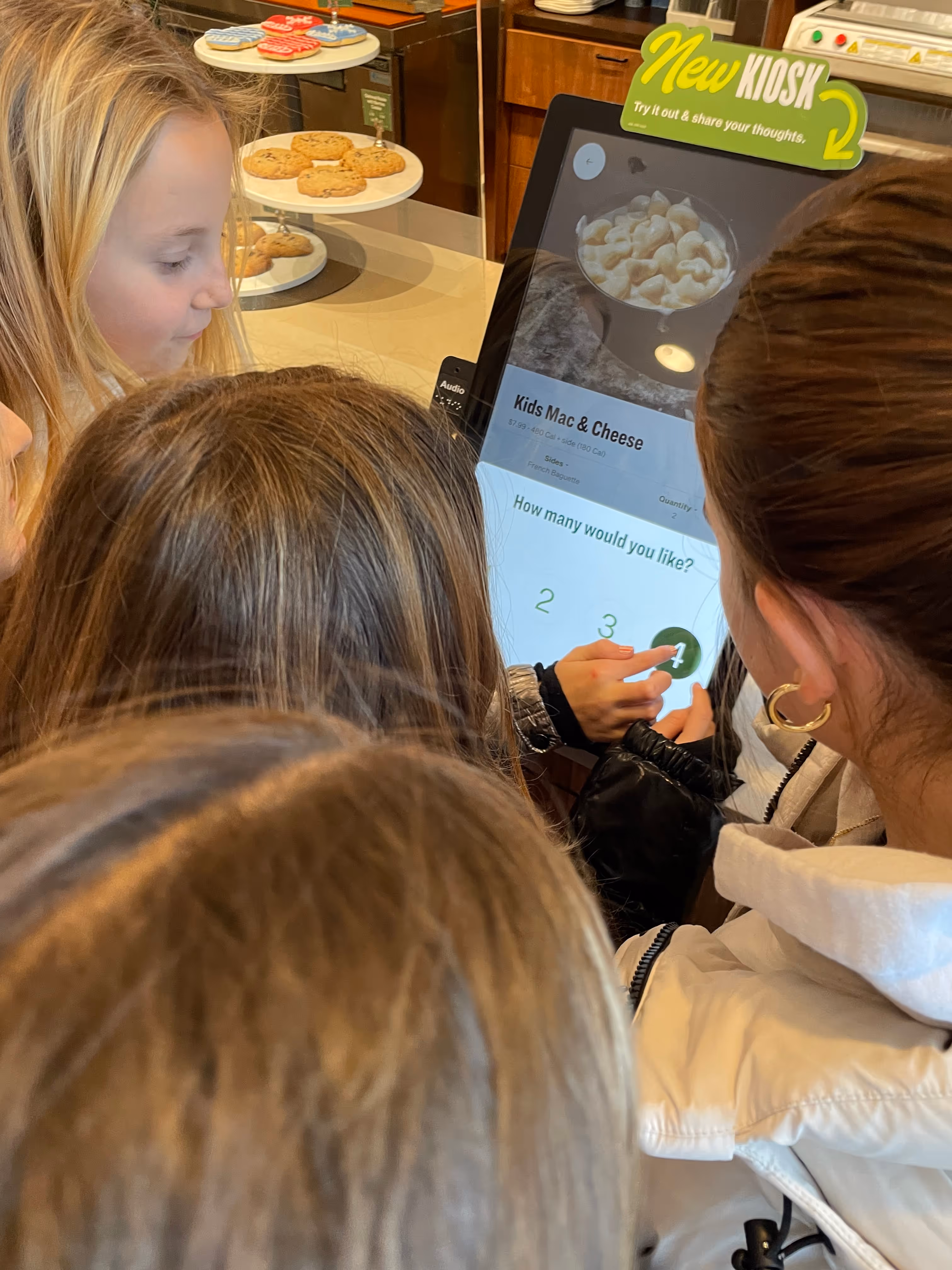
Our talented researcher conducted usability testing some key kiosk user flows at one of our cafes
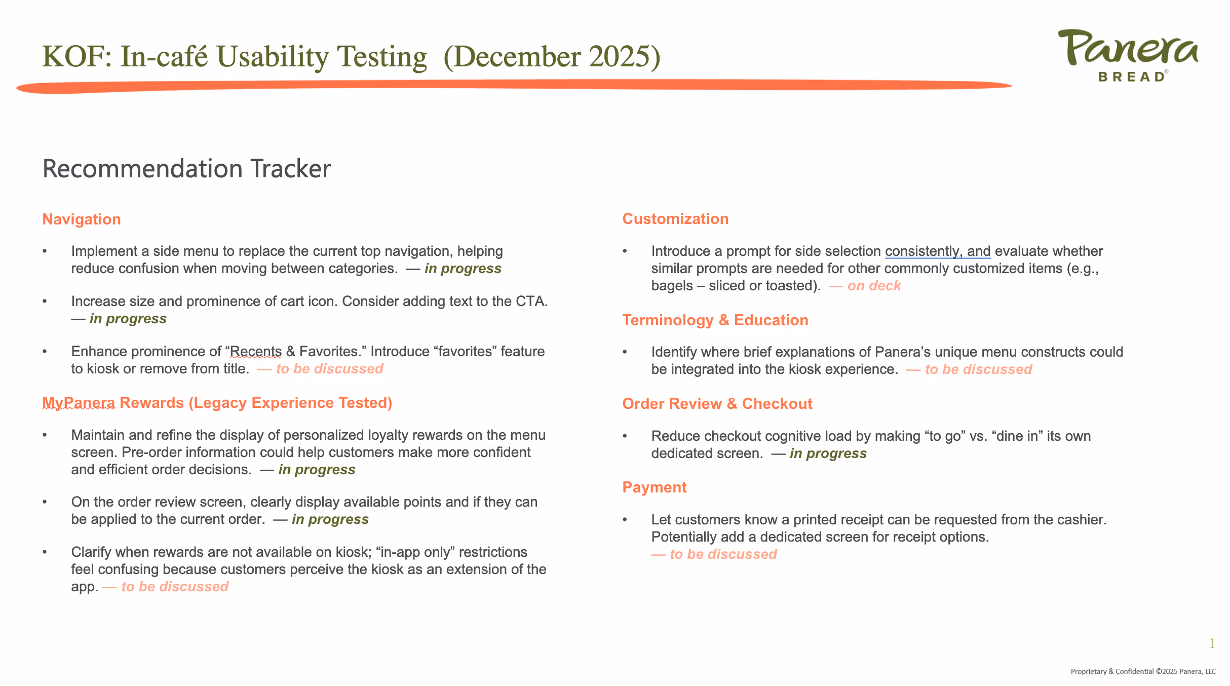
Slide of recommendations from usability testing presented to stakeholders
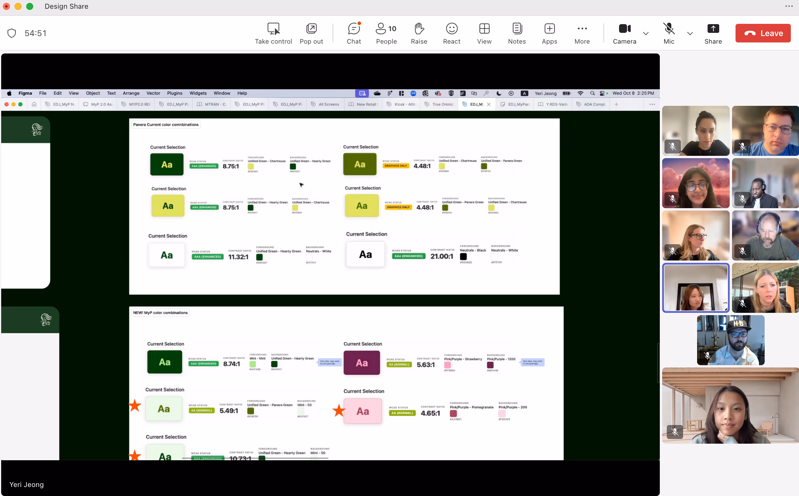
Design share speaking about the new color palettes we created for the subscription service team

.gif)
Contrast checker I created using Claude to easily distinguish AA color pairings for our Brand team