Designing the task dashboard

Enterprise Tool

0 to 1

Information Architecture

Visual Design

ROLE
Product Designer

PLATFORM
Web application on desktop

TIMELINE
Dec 2023 - Feb 2025

TEAM
2 Designers, 5 Product Managers,
1 Product Director, 4 Engineers

overview of the product
Outdated software = lack of business efficiency = irritated customers
Conservice is the nation’s largest utility management and billing services company. However, it is currently facing business and process inefficiencies caused by outdated legacy systems comprising 130+ products and 50+ interfaces. These inefficiencies led to duplicative efforts, operational bottlenecks, and accuracy issues, impacting both employees and clients.

Current softwares employees are using to complete daily work 😵

To address this, we created Portal, a React-based web application designed to unify user experiences for clients and internal teams while streamlining operations.
Instead of managing countless outdated applications...we now have a single, dynamic platform tailored to each user’s role and needs, with a personalized dashboard that adapts accordingly.
project highlight
One of Portal’s first major initiatives was the exceptions app, aimed at solving key inefficiencies in the bill exception resolution process

Problem
Exception analysts faced a fragmented workflow, juggling multiple tools to complete a single task. Disorganized and irrelevant information further slowed their process, leading to inefficiencies and operational bottlenecks.

Solution
Designed a scalable exception management application, centralizing provider communication and introducing a single-view bill interface. By streamlining workflows and automating key processes, the new system reduced redundancy and improved efficiency across four teams.

Impact
The new application eliminated duplicative efforts, reduced manual work, and improved accuracy in exception handling. Analysts spent less time switching between tools, onboarding was accelerated, and operational costs decreased through automation and improved task visibility.

My Role
Product designer, responsible for research synthesis, information architecture, user flows, and interface design. I worked closely with stakeholders to align priorities, iterated on designs based on user feedback, and ensured the solution was scalable for future workflows.

context
An exception is a stage in the bill processing workflow where a bill requires human intervention to address specific issues
👀
Example: A utility bill for a commercial property is usually around $5,000 per month, but one month, the system flags a charge of $50,000. Since this is an extreme cost increase, an exception is triggered, pausing the funding process until an analyst reviews the bill, verifies the charges, and either approves the payment or resolves any discrepancies with the utility provider

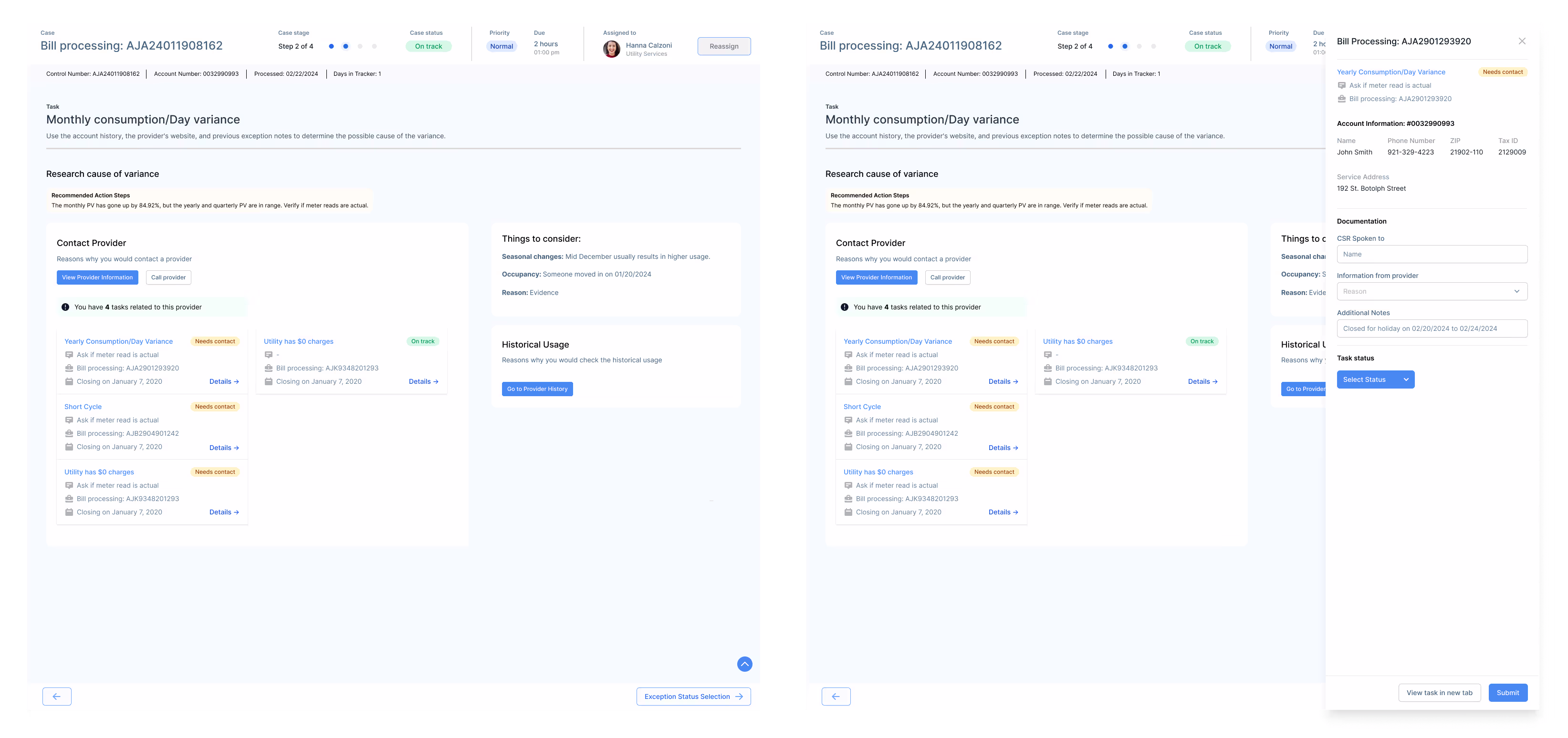
The "dashboard" an exception analyst uses to view and work on their daily tasks

Conservice has 11 common exceptions, each with specific triggers
These are categorized by the system in an exception analyst’s folder, helping them quickly identify and determine the appropriate handling process for each exception. An analyst has to complete an exceptions task in order for the billing case to move forward in the process.
the business problem
Exceptions is a top priority to address in order to improve client trust, operational efficiency, and data integrity QA. Current challenges:
👯
Duplicative efforts
Multiple teams conduct different versions of QA throughout a bill’s lifecycle
⛓️💥
Operational inefficiences
Time is wasted on false positives, manual tasks, poor visibility, and lack of clear ownership

Accuracy issues
The process lacked structured workflows, making it difficult to ensure the right exceptions were flagged
objective
Business and user goals we set out to solve
1. Improve Data Accuracy
Ensure only valid exceptions are flagged, reducing unnecessary manual review.
3. Enhance Operational Efficiency
Reduce time spent navigating multiple tools, improving resolution speed
2. Streamline Collaboration
Centralize provider communication and create clear task ownership.
4. Accelerate Onboarding
Introduce a structured system that reduces training time for new analysts
research
To validate these challenges, we conducted user interviews with 10 exception analysts to understand their workflows, pain points, and behaviors
Key takeaways 🎆
1. Multiple applications required
Completing one exception involves switching between 4-6 different software tools at each stage
4. Myriad of irrelevant information
Analysts often encounter irrelevant info since the softwares is built for all employees and all types of work
2. Consistent process, unique workflows
All exception types follow the same process but differ in tools used, people involved, and required actions.
5. Analysts prioritize speed and efficiency
Analysts are experts in their role and aim to complete as many tasks as possible everyday, as they are billed by performance
3. Shared information is essential
Employees across Conservice are responsible for updating and maintaining shared data used across teams
6. Onboarding new analysts takes a lifetime
New analysts take at least 1.5 years to ramp up, as experts rely on memory to navigate tools and processes
Based on these insights, we conducted a needs analysis to map out key pain points and prioritize solutions. We identified two core problems we wanted to focus on when creating the new application:
user problems
1. Analysts struggle with a fragmented workflow and tool overload
They must switch between 4-6 different applications to complete a single exception task, leading to inefficiencies and increased cognitive load

Gmail to email providers and clients updates/questions

System health to view their tasks and open up bill images

Excel sheets to view standards of procedures for exceptions

Google docs for notes to streamline their personal workflow

2. Analysts face challenges due to irrelevant and disorganized information
Existing tools present excessive, non-contextual data, making it difficult to quickly locate the necessary details for resolving exceptions.

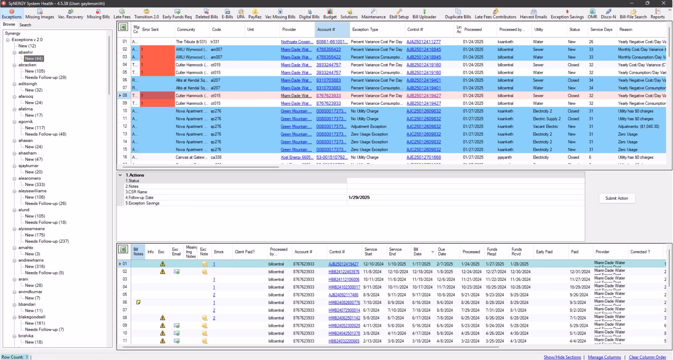
Exception analysts must reorder dashboard columns to access relevant data since they share the same interface as all employees
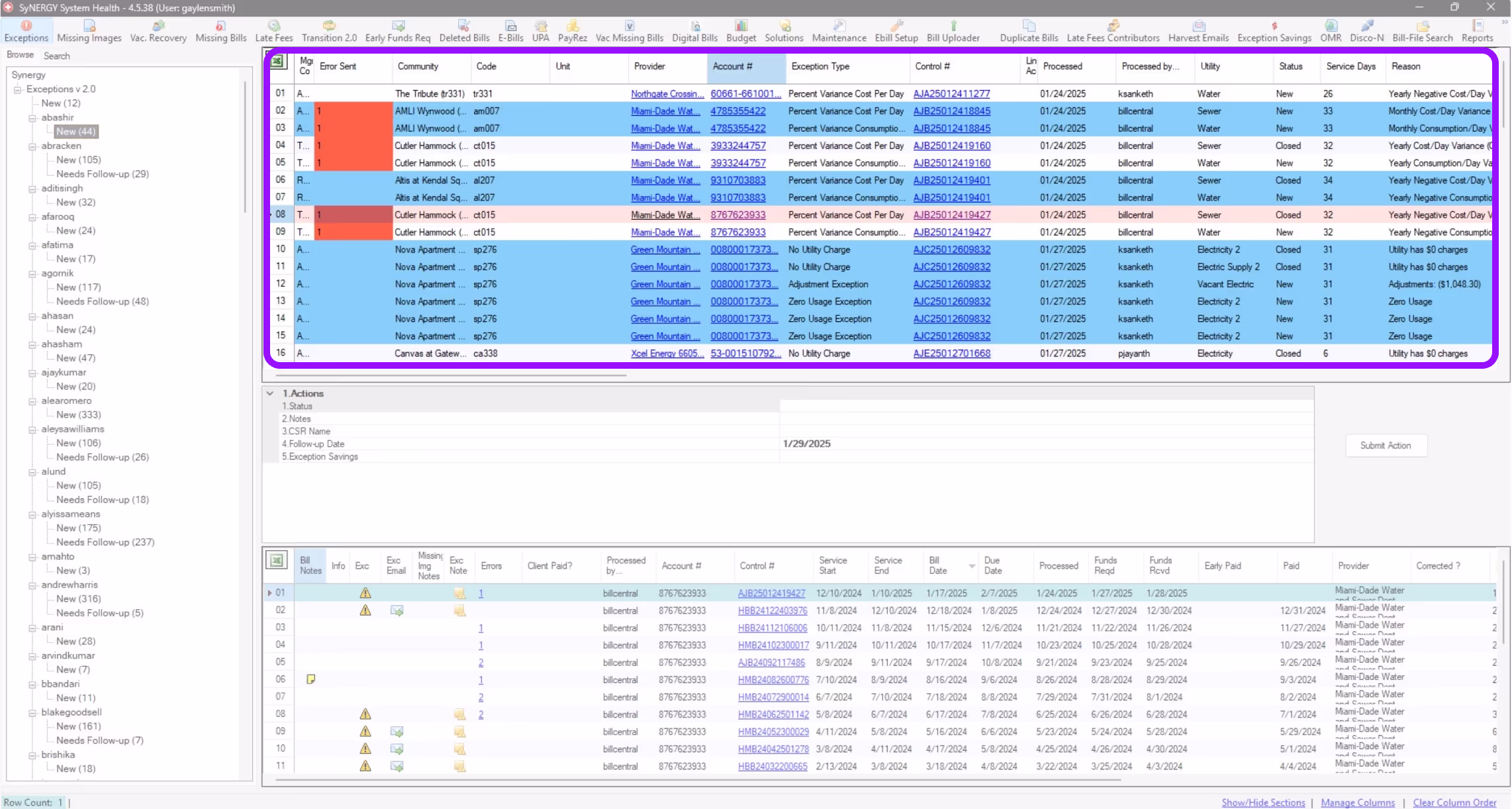
The next step was brainstorming, ideating, and exploring concepts that would resolve the user's problems.
ideation
Began by exploring multiple approaches to map out the information architecture and user flow, each one bringing us closer to a system that made exception resolution not just faster, but intuitive
With an overwhelming amount of data to scour through, these methods helped us cut through the noise and find clarity. Through iteration and testing, we shaped a structure that turned a once-complex process into a smooth, efficient experience.
Created an end-to-end visualization of all the features required at each screen to support analysts in completing exception tasks. This helped guide the creation of low-fidelity designs by clearly outlining the necessary data and interactions at every step of the process
explorations
Brainstorming designs and ideas
Since we're creating a proof of concept, we're focusing on building fast and iterating whenever we have the chance. With the IA and user flow mapped out, I decided to build out the end-to-end screens with a focus on the features.
Here are some explorations of my focus areas during these designs:
Defining the UI of the application
With so much information and ample space for displaying actions, I focused on establishing a clear hierarchy and layout. The key requirement was integrating the exception workflow within the pre-existing case management structure, ensuring consistency while optimizing data presentation and task accessibility.
I applied a progressive disclosure design approach since there were distinct stages identified in the exceptions workflow. I prioritized displaying only the essential information and actions needed at each step, ensuring visual clarity and reducing cognitive load for analysts.
Focusing on: Enhanced Data Visibility
Building on the progressive disclosure pattern, I incorporated feedback by adding missing information, a detailed bill data breakdown for the initial quality check, and additional meter-related details to support more comprehensive bill analysis.
Designing a Streamlined Bill Research Companion App
The primary purpose of the companion application (which we've dubbed the bill research application) is to support analysis with minimal user interaction. By limiting actions within this app, we aim to streamline workflows and ensure it can be repurposed for other research tasks in the future.
The control bill data associated with the task remains fixed on the left side of the screen, while bill history, provider information, and account details appear as users select each section. Version 1 was designed based on assumptions about analysts’ needs, derived from interview insights.
Incorporating feedback from SMEs, I streamlined features to balance functionality and development efficiency. Instead of breaking down bill history, I included the full table for quicker implementation. For provider profiles, I displayed only the sections essential to exception analysts. Additionally, I added account verification information to support phone calls with providers.
The final version featured improved visual design and clearer data hierarchy for easier navigation. After discussions about privacy, sensitive data required PIN entry for secure access. Analysts can seamlessly switch between viewing bill data and bill images, offering flexibility based on their workflow needs.
Handling notes and communication within teams and with external clients
We needed to work through how to document what is happening with the exceptions and how to communicate with clients when needed.
Initially, documentation and client communication were treated as separate steps in the progressive disclosure flow. However, user feedback revealed they are closely linked.
The existing notes section allowed analysts to enter unstructured text in any format. To create a more organized and uniform approach across Portal, I restructured it by limiting note options to predefined categories, including common actions taken, issue types, and issue details. On this slideover, analysts are also able to customize messages to clients as it would be a part of the documentation process.
Restructured the slideover to align with updated user flows. Rather than including related tasks within the same view, I prioritized documentation specific to the task at hand for better focus and clarity.
Optimizing for Multitasking: Enhancing Workflow Efficiency
Analysts often juggled multiple tasks at once which was a key workflow behavior I initially overlooked. Through research and iteration, I refined the design to better support their multitasking needs.
Alongside notes, the first version introduced a quick close feature for tasks within the same case and bill, addressing the system’s tendency to generate multiple tasks for a single issue
However, we quickly realized that analysts handled multiple tasks in various ways. I identified three key categories: tasks related to the provider, tasks related to the case, and tasks related to the account, with each requiring distinct resolution flows.
Through deeper analysis of the workflow, I observed that analysts often group tasks by provider. They handle multiple accounts in a single phone call to improve efficiency. This insight informed design decisions to better support task stacking and streamline communication with providers.
refine
Due to the introduction of a new product, our team decided to conduct moderated testing with five analysts to understand if we were heading in the right direction
We organized our questions and assumptions, grouped similar ideas into key topics, and designed user testing questions and tasks accordingly.
💡
We created a Maze test and conducted moderated testing. Given that analysts had never participated in user testing and time was limited, this approach allowed us to gather insights efficiently.
Key takeaways 🎆
Analysts navigate non-linearly
Instead of following a step-by-step flow, analysts jump between sections.

💡
Rather than changing this habit, the interface should display all relevant information at once to support their workflow.
Multitasking is essential
Analysts manage multiple tasks simultaneously due to wait times caused by clients and providers.

💡
The companion app should automatically sync with the task they are viewing, reducing manual effort and improving efficiency.
Clear bill comparison
To help analysts easily distinguish between bills, we need to present information in a clear and organized manner

💡
By using color coding, visual cues, and side-by-side comparisons, we can make it straightforward for analysts to identify differences.
Adapting to a new system takes time
Since analysts are transitioning from familiar workflows to a completely new platform, there will be a learning curve.

💡
To ease adoption, we should incorporate onboarding guides, tooltips, and contextual help within the interface.
The results showed analysts were open to the new product, but understandably hesitant since most had been using the same tools for over six years. To build trust, we emphasized that their workflows remained the same; we were simply giving them better tools to do what they already do..faster and more efficiently.
solution
A scalable application to improve efficiency and reduce operational costs
We designed a user-centered application that adapts to exception analysts’ existing workflows and behaviors, rather than forcing them to conform to outdated systems.

Through restructuring user flows and prioritizing essential features, we streamlined their tasks for greater efficiency. Beyond solving analysts’ pain points, this solution established a scalable foundation for handling high-volume tasks within Portal.

The features highlighted below focus on solving for user problems we identified above:
By introducing a supplementary application, exception analysts can easily differentiate and prioritize relevant information

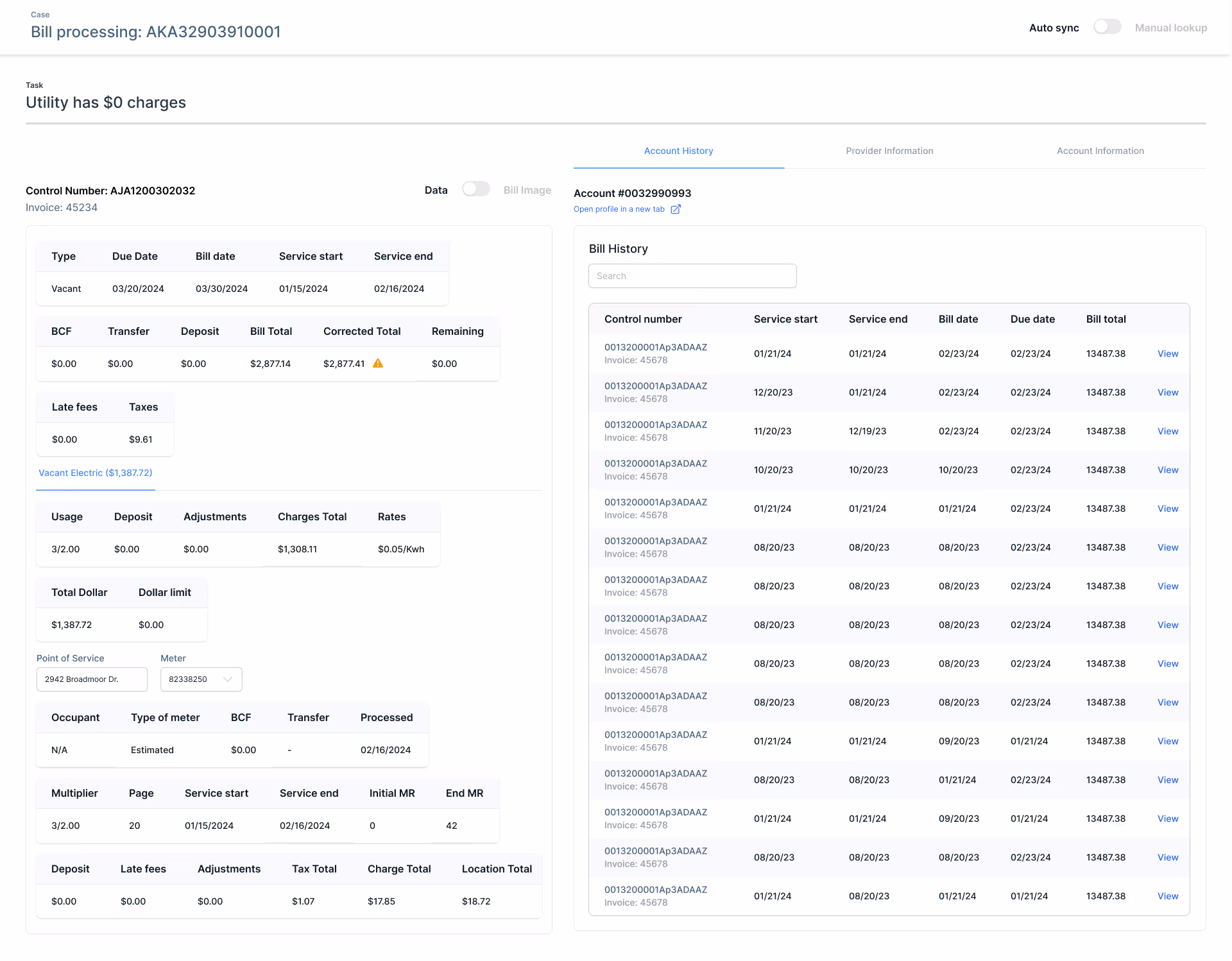
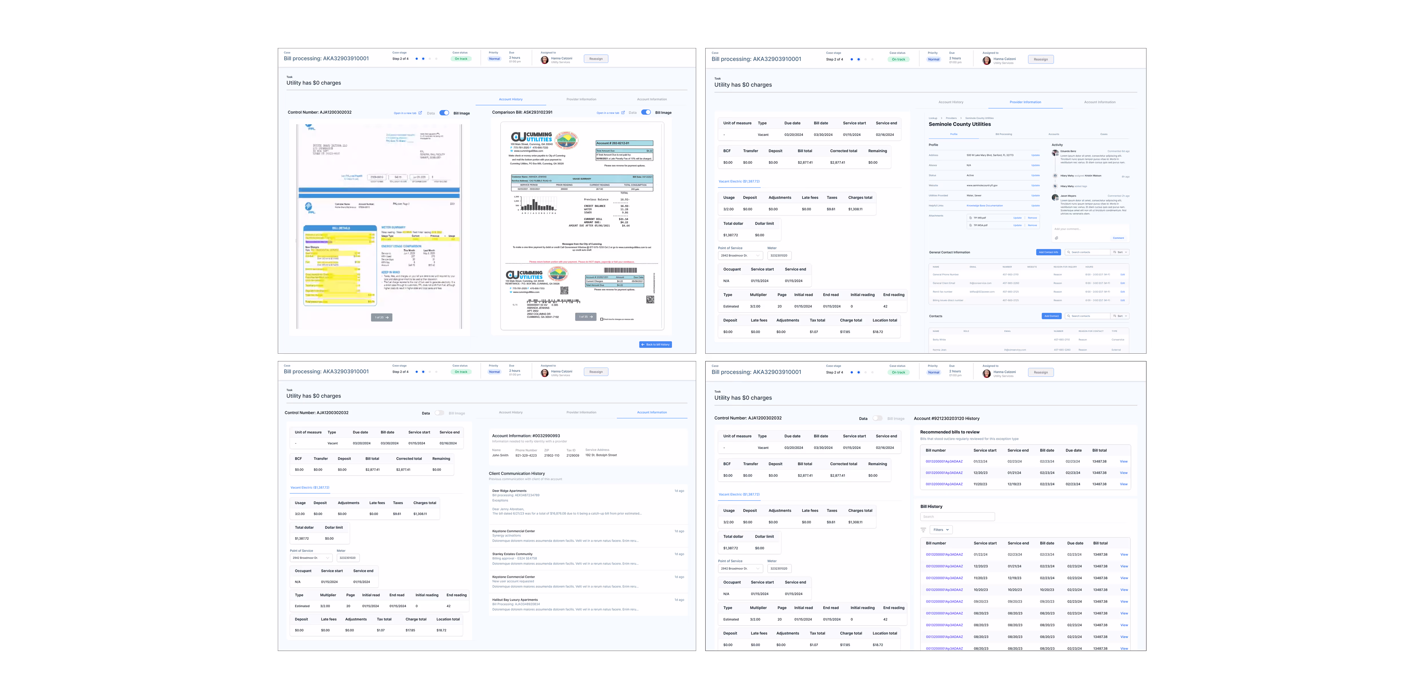
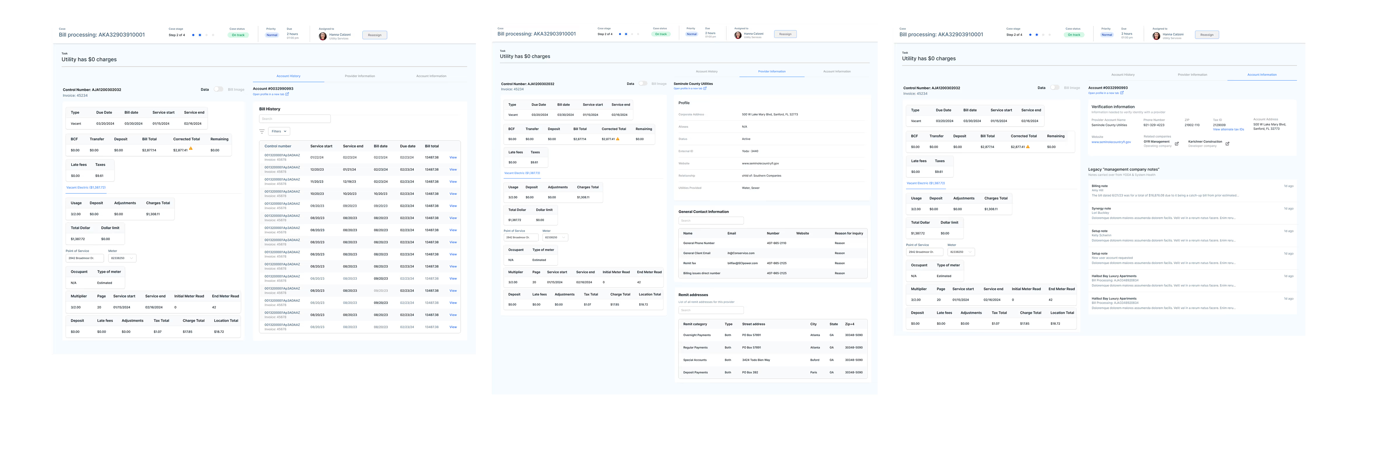
Analysts can access the account’s bill history and select a specific bill for comparison

Analysts can toggle between the bill data breakdown and the actual bill image, and they can do the same for the comparison bill

Analysts can view provider contact information tied to the specific case

Analysts can quickly access the required information to verify their identity when contacting a provider

By designing features that support multitasking, exception analysts can seamlessly switch between related tasks as needed

Analysts can review recent provider account history to identify relevant changes or tasks impacting the exception and directly contact the case owner for any clarifications

Analysts can view and update related exceptions for a provider, allowing them to resolve multiple issues in a single call instead of handling them separately

Analysts can view and edit related exceptions within a case, using the same notes to efficiently close multiple tasks at once

Analysts use 2 to 3 monitors, allowing the exceptions dashboard and bill research application to work seamlessly together for efficient multitasking.

Impact 🎯
👯
Elimated Duplicative Efforts
Designed a centralized exception management system, reducing redundant QA processes across four teams and decreasing duplicate reviews by 50%, leading to a 25% faster exception resolution time
⛓️💥
Improved Operational Efficiency
Introduced automation and a single-view bill interface, cutting manual tasks by 30%, reducing exception handling time by 20%, and shortening new analyst onboarding time by at least 1 year
🤓
Enhanced Accuracy & Visibility
Implemented a structured exception-handling approach that improved bill accuracy by 35%, reduced incorrect flags by 50%, and lowered the number of unnecessary rework cases by 40%
🧠
Established Design as a Strategic Partner
Advocated for design as a key driver of operational improvements, influencing product roadmaps and securing buy-in for three additional design-led initiatives focused on efficiency and scalability
Future enhancements
Onboarding Support: Implement guided features to help analysts navigate and efficiently use the applications
Iterative Development: Continuously refine the application based on analyst feedback to enhance usability and clarity
Automation & AI: Introduce AI-driven insights to optimize workflows, such as seasonal trend predictions
Scalability: Expand the application’s framework to support workflows for additional employee groups
Takeaways
Prioritizing speed
This project taught me how crucial it is to balance speed with quality. By prioritizing the most impactful features and iterating quickly, I was able to deliver a solution that addressed immediate needs without compromising the long-term vision.
Designing for expert users
I gained a deeper understanding of the challenges that expert users face. By focusing on their specific workflows and providing them with the tools they needed, I was able to design an intuitive system that improved their efficiency and kept them engaged in their daily tasks.
Making use of limited resources
With a small team and limited access to users, I learned how to make the most out of what’s available. By focusing on core functionalities, leveraging existing assets, and prioritizing features based on user needs, I was able to deliver a solution that met both user and business goals effectively.
Back to Top
other projects i worked on
I delivered integral products across multiple product portfolios
I established the foundation of Portal, unifying and modernizing over a dozen legacy systems, streamlining operations, and improving cross-platform consistency! From working on stand-alone tools, ad-hoc projects, high-volume workflows solutions, and cultivating the user experience design team, here are some highlights:
Designed one of the five global capabilities of Portal: Tasks Dashboard
An enterprise-wide task and workload management interface, supporting both large-scale workflows and individual tasks linked to parent cases. Focused on the tagging system, table structure, information architecture, and UI, while mapping out edge cases and complete user flows.
Designed a unified flag manager app to streamline error detection and resolution across bill data
Focused on consolidating flagged issues into a single interface, enabling users to review, validate, and resolve discrepancies efficiently, replacing the google sheets tracker and working toward decommissioning two legacy apps.
Designed various mini-apps to manage configuration settings for a specific entity
Created an update process for properties, replacing manual Excel-based requests with a streamlined internal submission system. Focused on improving data structure and information architecture to create a scalable, user-friendly experience for managing property-specific funding updates, replacing the previous fragmented experience.
User research across 20+ user groups
Facilitated continuous discovery sessions to uncover core capabilities, map workflows, identify pain points, and prioritize design needs in order to create an universal interface.
Created Conservice's first design system
Built components to meet application needs while establishing reusable patterns to ensure consistency and efficiency across product portfolios.

Thanks for being here. ٩(。•́‿•̀。)۶

⤹˚˖ ୭ Home page
National Geographic °˖➴